Showing posts with label Sixteenth Century. Show all posts

Friday, May 10, 2013

A Magnificent 16th Century Woodcut On Perspective

by Stephen J. Gertz


The above woodcut, one of the most dramatic of the sixteenth century, is the variant title-page to the first edition of Daniele Barbaro's La Practica della Perspectiva, a virtual summary of contemporary architectural theory and the first systematic treatise on the practical applications of perspective, published in Venice by Borgominieri in 1569.

It's geometrical representation of a mazzocco, or interlaced ring in perspective, surrounded by satyrs and cherubs with drawing instruments.
 
The first edition of La Practica della Perspectiva was published in two issues, identical except for the date of imprint (1568 for first). Some copies of either issue also contain this variant title-page. A copy that has recently come into the marketplace, for example, is a second issue with the variant woodcut title page. Although this more dramatic title-page is found in both issues, it is far less common in the marketplace.

Many of the schematic woodcuts are closely related to Albrecht Dürer’s artist manuals, and the woodcuts of stage sets borrow from Italian Renaissance architect Sebastiano Serlio (1475-1552), who wrote eight books on architecture 1537-1575, and discussed the use of perspective in the theater in the second book of his Archtettura series, Le premier livre d’architecture... Le second livre de perspective, de Sebastian Serlio..., mis en langue francoise, par Jehan Martin... (Paris, Jean Barbé, 1545).
 
Barbaro (1514-1570) studied a variety of subjects including mathematics and natural sciences at the University of Padua. He had a diversified career: he was appointed for the creation of the research-oriented botanical garden in Padua, was a Venetian ambassador to the English court, and was made patriarch elect of Aquileia. He also directed the iconographic program for the ceiling of the Sala dei Consigli dei Dieci—frescoed by Paolo Veronese—at the Ducal Palace in Venice.
__________

BARBARO, Daniele. La Practica della Perspectiva. Venice: Borgominieri, 1569. First edition, second issue. Folio [340 x 210 mm]. 195 pp., (6) ff. Variant woodcut titlepage. Approx. 220 woodcut text illustrations. Bound in early vellum, with minor worming and chipping to covers, and title written in ink in an old hand on spine. Quire H4 (pages 57-64) is misbound as Ha, H, Hd, Hc, with all leaves present.

Fowler 36; Mortimer Italian, 39; Vagnetti E IIb23; Wiebenson III-B-7; Berlin Kat. 4694; Kemp, The Science of Art, 76-8; p. 189.  
__________

Image courtesy of Martayan Lan Rare Books, currently offering this title, with our thanks.
__________
__________

Tuesday, October 9, 2012

Typographical Dingbats Explored: Raising a Glass to the Sixteenth Century

by Alastair Johnston
 
Hendrik D. L. Vervliet, Vine Leaf Ornaments in Renaissance Typography. A Survey. New Castle, DE: Oak Knoll Press and Houten, NL: Hes & De Graaf, 2012. 416 pp., hardback.


In my capacity as a typographer, I am often asked, "What are those little doohickeys called?"

 - Dingbats!

 "Hey, who are you calling dingbats?!"

While it may sound like a Yiddish word for a simpleton, dingbat is the technical term for non-linguistic parts of a fount of type, Edith. The great German type designer Hermann Zapf made a whole load of them that, combined, can be used to create wild borders or bring humor or punctuation to typesetting. Of course inventing glyphs yourself with the keyboard is more fun. My best effort at creating an emoticon is the grinning baboon: 8=}

In the manuscript era scribes would add pointing fists for emphasis, pilcrows to indicate a new paragraph, and sometimes fill out a line of their manuscript with curlicues or doodles. They had horror vacui, but vellum was at a premium so they didn't like to leave blank space. Decoration could also be used to mask errors: you could cover your mistake with squiggles and then write the correct text afresh on the next line. In the early days of typewriter some bright spark realized that not everyone could spell accurately so came up with a key that was neither an "a" nor an "e" that you hit for an indistinct character. Progress!

Surprisingly, in the early days of type, before sextiles, octothorps, interrobangs, shnik-signs, lb-signs or other commercial symbols were invented, type-cutters felt a need for and created a purely decorative small heart-shaped device with a stem, called a vine leaf (sometimes erroneously known as an Aldine leaf).


Hendrik Vervliet, Librarian emeritus at the University of Antwerp and former Director of the Plantin-Moretus Museum, has created a visual index to over 200 of these ornamental vine leaves found in Renaissance books. He has also identified most of the cutters and given information as to where they first appeared. It's a staggering task, though perhaps in scholarly terms, just a by-product of his decades of research on the types of the same period.

In the last couple of years Dr Vervliet has published a Conspectus of French Renaissance Printing Types (2010) and two volumes on the Paleotypography of the French Renaissance (2011) which complement his earlier works, including Sixteenth-century Printing Types of the Low Countries (1968). These two recent books finally click into place the whole jigsaw of the spread of roman type after it left Italy in the 1530s and started to move out from Lyons and Paris to Antwerp, Orleans and Geneva, and finally peripheral locations like London and Stockholm.

De Recta Latini & Dialogues of Erasmus, published by Simon de Colines, 1528, and showing his vine leaf on paragon body of 1522 (ex: Bibliothèque André-Desguine, Paris)

In these works, Vervliet identified the roles and work of the major players, Claude Garamont and Robert Granjon, and lesser-known type-cutters Simon de Colines, Pierre Haultin, Guillaume Le Bé, Antoine Augereau and Maître Constantin. Haultin was first to cut small types that were large on the body, therefore more legible in tiny sizes. These were needed for printing the Calvinist Bibles which had to be small enough to be hidden. Well in advance of the Gideons, their promoters would go through Geneva at night and throw their Bibles through open windows! De Colines was a great artist, both as a type-cutter and as a book designer; Le Bé was the go-to guy for Hebrew type; while Constantin and Augereau perfected the Venetian model of Aldus and produced the first families, or graduated series of type sizes that matched.

While Garamont (whose name is still known in its modern form of Garamond) was the technical perfectionist and supreme type-cutter of the Baroque period, Granjon got to play in the margins, cutting lovely types based on his own handwriting (called civilité: also the subject of a major study by Vervliet with Harry Carter in 1966), he refined and realigned italic, putting it into the shape we know today, he cut many non-roman types (Arabic, Cyrillic, Greek, Armenian, etc), cursive music (thus, it could be argued, paving the way for music to swing and eventually ... to jazz!), and a series of interchangeable abstract designs on type bodies called "arabesques" that could be built up to make patterns and borders. These could be cast fresh and combined to fit any space, unlike woodcuts which wore out or had to be cut down to suit new occasions. These printers' ornaments are distinct from vine leaves though (and were the subject of a 1955 essay by Stanley Morison, called "Venice and the Arabesque Ornament").

Vine leaves had been used as word dividers in the ancient world (seen in Greek and Roman inscriptions of the first century) and continued to be used like this or as a period, new paragraph indicator or line filler in the manuscript era. Vervliet believes the first printer to employ a typographic vine leaf was the great Erhard Ratdolt (1447–1528) who gave us the structural apparatus (title page, page numbers, chapter divisions, and so on) that we still rely on today. The leaf soon evolved into a purely decorative motif.


The vine leaves are surprisingly varied in style. I had always thought that there were only one or two forms, but in the end their diversity strikes me like the Bechers' photo documentation of German gasometers, water towers, and half-timbered houses that magnify little differences by juxtaposition.

These symbols form part of a complex vocabulary, encompassing the shapes of the roman alphabet and the ancillary glyphs that we encounter every day. These forms were in flux in the early era of printed books but left the hands of the French cutters in a form still recognized today. In many ways they are the substructure of our written and printed culture for we have never improved on the models of Garamont and Granjon. To see them afresh, five hundred years after they were created, is what Vervliet has done. Though it is a minor part of our culture it is still an important one and these masters need to be celebrated, both for their work and their play.

Last year's harvest was big in France and this has been a bumper year for California's grapes, so let's raise a glass to the punch-cutters of yore who decided to give us the typographic vine leaf.
__________
__________

Tuesday, June 26, 2012

What To Expect When You're Done Expecting: Dr. Spock in 1577

By Stephen J. Gertz

Safety Helmet.

It's in Latin, so it's not quite what you want to have on the nightstand when your baby or child has a bad case of whatever and you can''t translate "Vocant IX-I-I" in time for the paramedics to arrive and resolve the crisis before your kid kicks the bucket.

But though not a popular guide, De arte medica infantium by Omnibonius Ferrari (1577) was a key go-to book on pediatrics, Dr. Spock's Baby & Child Care for sixteenth century doctors and Latin-literate parents who could afford it.

Breast Milk Pump.

Divided into three parts, in 195 pages it covers the management of wet nurses; the care and feeding of the newborn; and the diseases of children.

Typically bound together with De arte medica infantium aphorismorum, a list of 273 aphorisms by Ferrari on the care and diseases of children based on the writings of Hippocrates and Galen but with a number of additions from contemporary sources, the two works present the state of the medical arts for infant care.

Toilet Training.

Or particular interest for 21st century mothers are the four text engravings which illustrate a self-operated breast pump for harvesting milk, a device for training children to walk, a  potty-training  toilet, and a helmet made to protect the child's head from injury, each early designs for now commonplace items in the inventory of modern motherhood.

In an age of harsh conditions, the concept of the child as tender and vulnerable and in need of a nurturing environment was beginning to emerge. De arte medica infantium  was amongst the most important contemporary medical books of its kind and provides insight into views on  late sixteenth century child care and psychology that will be startling familiar to modern parents.

Rolling Crib For Training To Walk.

"The illustrations are of interest…as they show two commonly used child-training devices of the past – the running stool, ancestor of the present-day walker, and the chair stool,  which held infants in a sitting position. Both of these devices were denounced by Ferrarius’s contemporary Felix Wurtz, who described the undue strain they put on undeveloped infant muscles” (Norman).

"In 1577 Ognibene Ferrari of Verona, Italy, proposed that the home be 'child-proofed'; offered designs for developmentally appropriate walkers, potty chairs, and helmets; and argued that 'the greatest care must be taken that he does not see terrifying pictures, nor should the one who has charge of him shew himself to him with a stern look on his face, lest he cause him fright, and so through depression and overmuch grieving he be ill affected'" (Review of Nurturing Children: A History of Pediatrics in JAMA, Nov. 1, 2000).

Amongst the "terrifying pictures" that should probably be kept from tender eyes is any image of mama mia! Italian actress and mama Monica Bellucci in the lobby of the Excelsior hotel in Rome using Ferrari's breast milk pump while the paparazzi pretend to be ga-ga over her pair of peepers rather than endowments. Grown men can barely tolerate the view without convulsions, forget about little Gianni who might grow up to have visions of sugar plums fairies and marriage to La Cicciolina, a terrifying prospect indeed.
__________


FERRARI, Omnibonius. De arte medica infantium, libri quatuor. Quorum duo priores de tuenda eorum sanitate, posteriores de curandis morbis agunt. [Bound with] De arte medica infantium aphorismorum, particulae tres. Brixiæ [Brescia], apud Franciscum, & Pet. Mariam fratres, de Marchettis, 1577.            

First editions, two works in one. Small quarto. [xii], 195, [1] pp.; 22 pp. With errata, four engraved text illustrations, large illustrated woodcut initials, ornamental head- and tailpieces. Marchetti's anchor and dolphin device on both title pages.

Both reprinted in 1598 and usually bound as one.

Adams F-288 (Aphorismorum), F-289 (De Arte Medica, 1598 ed). Normon 787 (De Arte Medica), 788 (Aphorismorum). Grulee 452 (De Arte Medica), 454 (Aphorismorum).
__________

B. & L. Rootenberg Rare Books and Manuscripts is currently offering a lovely first edition copy of these two volumes bound together.
__________
__________

Wednesday, June 13, 2012

Stunning 18th Century Illuminated Hebrew Manuscript Comes To Auction

by Stephen J. Gertz


On Thursday, June 21, 2012, Kestenbaum & Company, auctioneers, is offering a  stellar collection of rare Judaica with many luminaries, not the least of which is a beautiful 18th century illuminated Haggadah, the Passover prayer book, with pen-and-ink and watercolor illustrations,  by the scribe Nathaniel ben Aaron Segal. Created in Hamburg in 1757, it is estimated to sell for $30,000-$40,000.

Note Ashkenasy square script.

In Hebrew with instructions in Yiddish, it is composed upon thick parchment and written in Ashkenazi square and waybertaysch (women's Yiddish) scripts with the text following the traditional Ashkenazi rites.


Known as the "Lilien" Hagadah, it is part of the collection of the Polish-Jewish artist and early Zionist Ephraim Moses Lilien (1874-1925), who is considered to be the leader in developing Zionism's artistic vision in the early 20th century. Owned by the family for nearly a century, the book was, for a period of time, loaned to the Bezalel National Museum in Jerusalem and was on prominent display in the Monumenta Judaica exhibition of 1963-64 in Cologne, Germany.

Bookplate of Ephraim Moses Lilien.

Nathaniel, the son of Aaron Segal, was a sofer starn - a scribe of Torah scrolls, phylacteries, and mezzuzahs - actively working 1757-1772 in Altona, Hamberg, and Wandsbeck. He is firmly credited with six illuminated manuscripts (four Haggadahs and two Mohel (circumcision practitioner) books.

Why, three hundred years after Gutenberg, were Hebrew books still being copied in manuscript and illuminated? It was an art form not to be discarded; examples survive from the 10th century Muslim community and scholarship suggests that Hebrew illuminated manuscripts date back to the ancient world. They reached their apex in Renaissance Italy, then began to decline as demand and the number of artisans dwindled.

Yet "a new phase in the development of decorated Hebrew manuscripts emerged in the 18th century in Germany and Central Europe, when wealthy Court Jews commissioned handwritten and painted books as luxury items. Many of these are personal prayer books, which include Haggadot, seder berakhot, seder tikkunei Shabbat, and seder brit milah. Some of these manuscripts were intended as wedding presents for brides and contain contemporary depictions of women. Many of the Haggadot were inspired by the printed edition of the Amsterdam Haggadah of 1695. Other features that reveal the influence of printed books are the inclusion of a decorated title page or the indication that the manuscript was written using otiot Amsterdam, the style of letters utilized for Amsterdam imprints, even though the book was written elsewhere" (Evelyn Cohen, Illuminated Manuscripts, Hebrew. Ecylopaedia Judaica, 2d ed.).


BTW: The star attraction in this auction is a copy of the Ferrara Bible, published in 1553. It is estimated to sell for $30,000-$50,000.

One of the great landmarks in printing, the Ferrara Bible is the first printed translation into Ladino, the  Judaeo-Spanish language, of the entire Tanakh, the Hebrew BIble (Old Testament).

Its publication was the work of Marrano Jews (New Christians) who brought the Spanish language with them after the Jewish expulsion from Spain in 1492 and had settled in Ferrara in northern Italy, which had a Jewish population as early as the 13th century. These Marranos, who had converted to Christianity strictly to successfully function in Spain, and, post-1492, to stay alive, returned to Judaism after their expulsion.


This translation, based upon earlier medieval Castilian versions, became the canon for the Sephardim (Spanish Jews) of Europe to whom matzoh balls are unknown. As we say in Yiddish,  Oy caramba.

__________

Images courtesy of Kestenbaum & Co., with our thanks.
__________
__________

Wednesday, April 11, 2012

Three Strange And Beautiful 16th Century Fantasy Maps, Another From 1617

By Stephen J. Gertz

MUNSTER, Sebastian. [Europe depicted as a Queen].
Basel, c. 1580. German edition. Colored. woodcut (260 x 160mm).
MCC I: 6.
During the late sixteenth century, a few cartographers designed and published a handful of maps with anthropomorphic countries and continents, with animal as well as human forms.

Sebastian Munster's created this famous example, a map of Europe that depicts the continent as a queen. The head represent Iberia, Denmark the left arm and Italy the right with Sicily an orb in her hand. The British Isles are shown, but not integrated into the figure. The map originally appeared in Munster's Cosmographei (1550).

BÜNTING, Heinrich. Asia Secunda pars Terræ in Forma Pegasir.
Magdeburg, 1581. German edition. Colored woodcut (300 x 370mm).

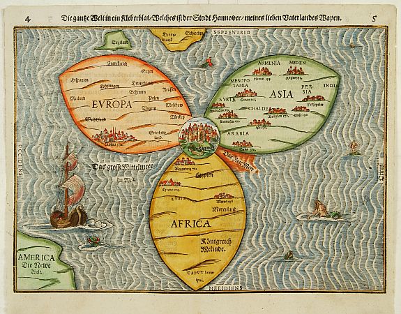
In the famous fantasy map depicting Asia as Pegasus, the winged horse of Perseus, the head is Turkey and Armenia, the wings Scythia and Tartary, forelegs Arabia, hind legs India and the Malay Peninsula. The map appears in Bünting's Itinerarium, in which the author, a theologian, rewrote the Bible as a travelogue, with other fantasy maps including the World as a cloverleaf.

BÜNTING,H. Die gantze Welt in ein Kleberblatt
Magdeburg, ca. 1581. Colored woodcut.
Shirley, World 142.

 And here it is. This extraordinary curiosity is referred to as the Clover-leaf, for obvious reasons. Heinrich Bünting's design was inspired by the trefoil form of the arms of Hanover, his native town. Despite the map's unusual appearance the fact that Jerusalem appears at the centre leans strongly on the tradition of medieval world maps. Bünting's work Itinerarium Sacrae Scriptura...was essentially a theological commentary with other maps of great curiosity.

VAN DEN KEERE, Pieter. Leo Belgicus.
Amsterdam, 1617. Colored engraving.
Van der Heijden, Leo Belgicus 4.2.

Pieter Van Den Keere's Leo Belgicus is, perhaps, the most celebrated example of cartography as patriotic expression. The lion had long been a national symbol of Holland and Belgium. Indeed, most of the coats-of-arms of the countries' seventeen provinces feature a lion. The map was a statement of unity, since at the time the seventeen provinces comprised a single nation, although under the control of Spain.

Van den Keere (Kaerius) was one of the most skilled Flemish engravers of the early seventeenth century. The Leo Belgicus is perhaps his finest work, its rich ornamentation includes three couples along the bottom in the characteristic dress of Friesland, Holland, and Belgium.
__________

First three images courtesy of Altea Gallery Antique Maps, Sea Charts, Atlases & Globes, with our thanks.

Image of Leo Belgicu courtesy of Barry Lawrence Ruderman Antique Maps, with our thanks.
__________
__________

Thursday, March 15, 2012

The Printer (1568)

by Stephen J. Gertz

Der Buchdrucker (The Printer).
From the "Ständebuch" (Book of Trades).
Frankfurt am Main, 1568.

Commonly known as the Ständebuch (Book of Trades), this, the first Latin edition of Panoplia, contains 132 woodcuts by Jost Amman, eighteen more than the first German edition of the same year.

The work is as much a social history as anything else. Social status plays a role but the primary emphasis is in praise of the handwork of the artisan class.

"In gathering, amending and amplifying a diffuse conglomeration of images Amman established a completely objective mode of picturing craft genre, free of contextual purpose other than the work itself. This is in marked contrast to both earlier religious and secular uses of genre scenes, and to contemporary low-life scenes, which, despite their probable antique origins, remained grotesque mimics of a limited range of social behavior. Amman’s pictures were intended as illustration for a curious public, as an informative record of local customs, and as a visual adjunct to a text which primarily encouraged the Protestant work ethic. They were not caricatures or vulgarizations, but semi-scientific documentation combining several old and serious methods of viewing daily labor. They thus isolated the work scene as autonomous branch of art, and gave it a new purpose as an independent subject. They act as a turning point between the religious genre of Peter Aertsen, or the low-life scenes of the Flemish and Italian satiric painters and popular printmakers, and the sober, realistic genre painting of the Carracci and their followers" (Rifkin, B.A. Introduction to the Dover Edition, New York, 1973, p. xxxix).
__________

SCHOPPER, Hartmann (1542-1595) and Jost Amman (1539-1591). Panoplia. Omnium illiberalium mechanicarum aut sedentariarum artium genera continens. Frankfort  am Main: (George Rab for Sigmund Feyerabend), 1568.

First edition in Latin. Octavo. 148 unnumbered leaves 132 woodcuts.

Adams S-703. Colas I, p. 35. Becker 13b.
__________
__________

Tuesday, February 22, 2011

The Most Celebrated and Influential Book on the Occult

by Stephen J. Gertz

First (and only) English translation.

"In the last half of 1509 and the first months of 1510, Heinrich Cornelius Agrippa, known in his day as the Magician, gathered together all the Mystic lore he had obtained by the energy and ardour of youth and compiled it into [an early draft of] the elaborate system of Magic, in three books, known as Occult Philosophy…The only English translation appeared in London in 1651" (Willis F. Whitehead, Preface to 1971 reprint).

“Recent historical investigation…assigns Agrippa a central place in the history of ideas of the Middle Ages. He is seen as characterizing the main line of intellectual development from Nicholas of Cusa to Sebastian Franck. Modern opinion evaluates him on the basis of his Platonic, Neoplatonic, and Hermetic influences – primarily in the De occulta philosophia” (DSB).

De occulta philosophia  is a defense of magic, by means of which men may come to knowledge of nature and God, and contains Agrippa’s idea of the universe with its three worlds or spheres [Elementary, Celestial, and Intellectual]’ (Britannica).
 
Heinrich Cornelius Agrippa (1486-1535).
 
Agrippa’s influence “added impetus to Renaissance study of magic and injected his name into early Faust legends. In [De occulta philosophia] he explained the world in terms of cabalistic analyses of Hebrew letters and Pythagorean numerology and acclaimed magic as the best means to know God and nature” (New Britannica).

First appearing in Latin in 1533, the book was translated into English by John French in 1651.
 
"John French (c.1616–1657), physician, was born at Broughton, near Banbury, Oxfordshire... In an era in which conventional approaches to the study and practice of medicine were under considerable attack, French seems to have aligned himself firmly with the cause of reform. In particular, he was a keen advocate of the chemical methods pioneered by Paracelsus and Van Helmont, whose ideas, and those of their followers, he attempted to popularize in the 1650s through original works and translations. [He] was well respected by many, including Robert Boyle, for his expertise in the practical side of chemistry and mineralogy" (Oxford DNB).
 
French's translation of Agrippa was, and remains since its original publication,  a strong influence on the study of magic in the English-speaking world.
__________

AGRIPPA, Henry Cornelius. Three Books of Occult Philosophy, written by Henry Cornelius Agrippa, of Nettesheim, Counseller to Charles the Fifth, emperor of Germany: and Judge of the Prerogative Court. Translated out of the Latin into the English Tongue by J. F. London: Printed by R.W. for Gregory Moule…, 1651.

First edition in English of Agrippa’s masterwork on the occult, originally published in Latin in 1533. Octavo. [2, blank], [1, blank], [1, frontispiece], [1, encomium], [1, blank], [24], 583, [1, blank], [12, Index] pp. Engraved frontispiece portrait, seven text woodcut illustrations, numerous occult symbols, and a folding table of alchemical symbology. Woodcut initials and headpieces.

Wing A789. Osler 1747. Lowndes 21. Graesse I, 45.
__________

Title page image courtesy of David Brass Rare Books, with our thanks.
__________
__________

Tuesday, December 21, 2010

The Rare Book That Turned Elizabeth I into Queen of Heaven

Yesterday, Queen of England. Today, Mother of God.

by Stephen J. Gertz


In 1578 an astonishing book was published in England, astonishing particularly if you were a Catholic. The volume, A Booke of Christian Prayers, contained a frontispiece portrait of Queen Elizabeth I, Britain’s reigning monarch, as the new Queen of Heaven, knocking Mary off the throne.


Further, the book, gloriously decorated with elaborate historiated borders, had illustrations within those borders that might trouble Christians of the Roman stripe. Some border details are distinctly anti-Papist.

The portrait had appeared in the first edition of 1569 yet this new edition was so different in content and appearance that the two editions (both commonly known as Queen Elizabeth’s Prayer Book) are considered to be separate works. With its historiated borders, their content, as well as the portrait of Elizabeth I, the 1578 is a magnificent and dramatically iconoclastic volume.


This famous woodcut portrait, possibly by lady-in-waiting and court painter Levina Teerlinc,  on the verso of the title-page depicts Elizabeth at prayer. "In an outstanding example of iconoclasm, Elizabeth receives the place of honor  in collections of prayers comparable to the Horae, in which the Blessed Virgin Mary once reigned supreme as Mother of God and Queen of Heaven" (King, Tudor Royal Iconography, p. 114). A prayer of Solomon which forms the epigraph suggests that the queen has supplanted the sage biblical king as wise governor who has re-established the Lord's Temple by imposing a Protestant settlement and bringing peace to Britannia. Down with the Church of Rome; up with the Church of England.


The striking woodcut borders, designed in the manner of Holbein and Dürer, give visual life to the prayers. Arranged in seven successive sections, each follows a different theme in the canon of Elizabethan popular devotional iconography: the life of Christ; the personifications of Christian virtues and vices; the action of Christian virtues in daily life; personifications of the senses; the the Apocalypse; the Dance of Death, and, finally, various elements of Christian eschatology.


The woodcuts are signed, and in three forms: the first series by an unidentified "C.I." and the Dance of Death with a "G" except for the penultimate signed "CT." Artist "G" may be Marcus Gheeraerts the younger.

What makes this book truly remarkable is its place within English printing history. At a time when the English printing industry was distinctly less sophisticated than that on the Continent, this is one of the few English books of the sixteenth century that can proudly take its place amongst the finest examples of contemporary European printing. As such, the book is a magnificent tribute to publisher John Daye's typographical skills.


"Richard Day (b. 1552, d. in or before 1606), printer and Church of England clergyman, was born at Aldersgate, London, on 21 December 1552, the son of the printer John Day (1521/2–1584)... In 1576 Day assisted his father in the printing of, and wrote some of the prefixed verses to, the third edition of Foxe's Actes and Monuments. The following year, on 28 August 1577, he was named as co-patentee when his father secured the renewal of a lucrative patent for the printing of a number of works including the Psalms in metre and the ABC with Little Catechism, although it appears that Richard may have gained his half-share by misleading his father about the terms of the grant.


"Day entered his first book in the company's registers on 28 May 1578, his own translation of John Foxe's Christ Jesus Triumphant. The work was followed by a newly prefaced edition of A Booke of Christian Prayers, Collected out of the Auncient Writers, otherwise known as Queen Elizabeth's Prayer Book. He also variously edited, translated, registered, and printed a handful of books over the next two years. However, his father evidently did not allow him to produce any works covered by the 1577 patent, as Richard took to pirating the little catechism and the metrical Psalms. As a result, in 1580 his father, then master of the Stationers' Company, assisted by the company's wardens, entered Richard's premises and took from him the bulk of his books, type, and press. No books were issued by Richard Day after this event.


"Despite an attempt by his father in his final years to revoke Richard Day's rights to the 1577 patent, the patent continued in Richard's name until at least 1604 although all printing for it was done by five nominated assigns. Richard died some time before 13 April 1606..." (DNB).


This edition exists in two states. The most readily available, albeit still quite rare, has the Preface signed “R.D.” In the scarcer variant the Preface is signed “Richard Daye.”

“As a repository of traditional iconographical material A Booke of Christian Prayers is unique among publications of the Elizabethan period” (Chew, The Iconography of “A Booke of Christian Prayers"(1578). Huntington Library Quarterly, Vol. 8, No. 3, p. 293).


__________

DAYE, Richard. A Booke of Christian Prayers collected out of the auncie[n]t writers, and best learned in our tyme, worthy to be read with an earnest mynde of all Christians, in these daungerous and troublesome dayes, that God for Christes sake will yet still be mercyfull unto us. London: John Daye, 1578.

First edition, the rare variant with Preface signed "Richard Daye,"  Octavo.  [12], [274], [1], [3 as index.], [1, colophon] pp., the pages numbered as 137 leaves. Woodcut engraved title page, woodcut frontispiece portrait of Elizabeth Regina at prayer.  Magnificent,  elaborately historiated woodcut borders designed after Holbein, Dürer, and contemporaries. Text in Roman and Black Letter.

ESTC 6429. Lowndes 1496.
__________

Images courtesy of David Brass Rare Books. Collectors may inquire here.

A tip o' the hat to Peter Harrington.
__________
__________

Tuesday, November 23, 2010

The Finest Map of the Holy Land, 1572

by Stephen J. Gertz

ORTELIUS, Abraham. Palestinae sive totius terra epromissionis.
[Antwerp, 1572]
Copper-engraved map, fully hand-colored.
348 x 465 mm.
Latin text on verso.
Laor 540.


A beautiful hand-colored copy of Ortelius' map of Palestine (Israel) from the 1572 Latin edition of Theatrum orbis terrarum (Antwerp: In Officina Plantiniana, Auctoris aere et cura),  considered to be the sum and  summit of sixteenth century cartography, will be auctioned at Bonhams-NY on Thursday, December 9, 2010.

Lower cartouche.

Upper cartouche.

The Theatrum orbis terrarum (Theater of the World), the first true atlas, went through twenty-five revised and expanded editions before Ortelius' death in 1598. From the original seventy maps in the 1570 first edition, it  had grown to include 167 maps within its thirty-fifth edition issued in 1612.

World map from Theatrum orbis terrarum.

The world has never looked so attractive, nor Israel so tranquil.
__________

Images of map of Palestine courtesy of Bonhams.
__________
__________
 
Subscribe to BOOKTRYST by Email