Showing posts with label fonts. Show all posts

Tuesday, December 11, 2012

Breaking News from the Sixteenth Century: Typography Takes Off

by Alastair Johnston


Stan Knight, Historical Types (From Gutenberg to Ashendene), Oak Knoll Press, 2012, 104 pp., hardback in dust-jacket, $39.95

Historical Types is based on a smart concept: an annotated picture book of enlargements of typefaces to show how they really look. After all, type is that tiny code we look at without really seeing it: it gives meaning to thoughts, but we rarely give it a thought.

Obviously this approach -- enlarged images of letterforms with commentary -- has been a key part of modern typographic education. A lantern slide show by Emery Walker in 1888, given to the Arts & Crafts Exhibition Society in London, where he projected blown-up images of Jenson, Ratdolt and Rubeus pages, inspired William Morris to start his own press. Walker, a commercial photo-engraver, went into partnership with T J Cobden-Sanderson to start the celebrated Doves Press after Morris' death. Bruce Rogers, who also knew Walker, had photo-enlargements of the Jenson pages made to draw his Centaur type.

As a teacher I rely on large projected letterform details to explain their subtleties. I often use images from a wonderful article, "Photographic enlargements of type forms" by Philip Gaskell, that was published in the Journal of the Printing Historical Society, no 7, 1972 (and is missing from Knight's bibliography). Gaskell's photos, which were printed 5 times actual size, have proven enormously useful in discussing type design and its evolution and are a significant precursor to what Knight has done.

Two gros romain romans attributed to Claude Garamont, from Gaskell's article in Journal of the PHS, 1971. The top type, from 1530, has since been identified by Dr Vervliet as the work of Maître Constantin (from Virgil, Opera, Paris: Robert Estienne, 1532 [R115]); the lower type, from 1549 (as seen in Dionysius Halicarnassus, Scripta Omnia, Frankfurt: Andrea Wechel's heirs, 1586) is by Garamont [R118]

However didactic his aim, Knight has not achieved the same compression and intensity that Gaskell did (in 11 pages!), perhaps because his book is aimed halfway between scholars or students and a general audience. But Knight has provided accurate information on these typefaces. This may sound odd, given that so much has been written over the last five centuries about the legacy of Gutenberg, Fust & Schoeffer, Jenson, and so on.

Faustus and Chauffeur (dubious attribution)

But we have discovered a lot of it is speculative or inaccurate and we can no longer rely on Stanley Morison, Beatrice Warde and D B Updike for facts about the design of type. In discussing Ratdolt's work, Knight cites studies from 2009 and 2011 (showing how type scholarship is constantly evolving). Fortunately we have James Mosley, who teaches at Reading, Charlottesville (Virginia) & London Universities, formerly the Librarian of Saint Bride's in London, as a guiding light in the search for typographic truth. Mosley has been blogging about such matters since 2006. His "typefoundry" blog has been a great resource for Knight, particularly in the untangling of Jannon versus Garamond, the actual spelling of Garamont's name, and other details.

Many documents have appeared to further the historical discussion, from the series of Type Specimen Facsimiles (under the editorship of John Dreyfus from 1963 onward), to the exemplary Enschedé (1993) & Plantin-Moretus (2004) facsimiles edited by John Lane. Some of the older facsimile works could be revisited with the new approach heralded by Knight, for example the 1592 Egenolff-Berner specimen sheet which was reproduced in 1920 by Gustav Mori in collotype. That sheet was the first specimen broadside to clearly identify Garamond and Granjon as cutters of their types and, as it was printed from newly cast type, was the best possible source for modern interpretations: Adobe Garamond by Robert Slimbach (among others) was drawn from it.

But for most of the twentieth century Garamond revivals (and there have been roughly a zillion of them) were based on the wrong type: a poor imitation cut by Jean Jannon in the French province of Sedan in the 1620s. This typographic Lady Gaga, a tragi-comic homage to classic typefaces, should have been left in the dustbin of history but accidentally gained an important place in the story of type development, so Knight has included it. Also included is a text debunking many of the myths about Jannon and Garamond (thanks to Mosley's research). One of the most fanciful stories has Cardinal Richelieu's troops looting Jannon's types to bring them back to the Imprimerie nationale in Paris. This yarn was first spun by Beatrice Warde in 1926 and picked up by Warren Chappell in his Short History of the Printed Word. As late as 1999 Canadian poet Robert Boringhurst was embroidering the fable in his edition of Chappell's book (p. 148), saying that after Richelieu’s armies seized Jannon’s type they felt bad about it so they reimbursed him for them!

As technology improves it greatly assists us in seeing what we are looking at (though collotype mentioned above is hard to beat). Up to now many books on type have used small illustrations of large pages shrunk down, printed from line blocks. In the end you cannot see any details. So the next step is to do more books of this kind that show, as closely as possible, the impression and the texture of the paper, and more specialized books. Knight's previous book was Historical Scripts (also from Oak Knoll) with a similar hyper-visual approach to the history of calligraphy.

Hendrik Vervliet's recent three volumes on the Paleotypography of the French Renaissance have illustrations from Xerox copies and photostats. [Aside: I published Vervliet's monograph on Robert Granjon: Cyrillic & Oriental Typography in Rome at the End of the Sixteenth Century in 1979. We relied on Velox photostats from the Vatican for illustrations, which were so poor, some were even out of focus, but how do you tell the Vatican their reproductive services are lacking?] Vervliet's images (many composites to show full character sets) were painstakingly assembled over decades and often Xerox was the only service available. It would be a useful task for someone to give the blow-up treatment (shot in high resolution with raking light to show the impression, as well as the paper surface) to his studies (now that we have the key data assembled), and then move into the following centuries. 

Garamont's gros romain roman [R118] from the 1599 Le Bé-Moretus specimen shown in Vervliet, French Renaissance Printing Types, 2010, p. 193

Nevertheless Vervliet's work is the major contribution to the field in the last half century. So it's great to see late-breaking news from the sixteenth century when Knight reproduces a page of revolutionary new type from Henri Estienne (previously attributed to Garamond [see top illustration]) and, thanks to Vervliet, we now have to acknowledge the shadowy Maître Constantin for this massive step-forward in the Aldine style which revolutionized roman letterforms across Europe.

Claude Garamont's gros romain roman as seen in Les Vies des hommes illustres, Paris: Vascosan, 1559, shown in Knight (p. 41)

I myself have done a little work in the eighteenth and nineteenth centuries but that indicated to me how much more needs to be done. Knight himself admits this is just a start: "Some worthy type designers like Pierre Haultin, Hendrik van den Keere, and Antoine Augereau are missing. But as well as the more famous names of Gutenberg, Granjon, and Bodoni, I have been able to include some lesser-known designers like Erhard Ratdolt, Simon de Colines, Johann Fleischman, and Alexander Phemister."

While to me there seem to be some close calls on who got omitted versus who got in, I think the general reader will enjoy the familiar mixed with the more exotic. The reader may balk at the name Miklós Tótfalusi Kis and be unaware that they have been lôôking at his type and versions of it all their lives.

I am sorry there is such a sadly inevitable bias towards the private press movement at the end of this study. There is certainly enough about William Morris, Cobden-Sanderson and St John Hornby out there in bibliomundo. A page on their cutter Edward Prince could have covered all of them (and freed up two pages). The Ashendene Subiaco type is a joke, or at best a footnote to the Sweynheym & Pannartz page; Eric Gill's Golden Cockerel type would have made a nicer terminus to the work. Otherwise, moving from Fournier to Bodoni is a big leap without including both Bodoni's early types that were imitation Fournier and the truly revolutionary types of Firmin Didot (which were cut by Pierre Wafflard). There is no easily accessible text in English which covers these most important steps forward in type design. William Martin (1757–1830) and Vincent Figgins (1766–1844) would have been solid inclusions and, despite most modern typographers' disdain for the excesses of the Victorian period, it cannot be ignored, but Phemister is the sole representative. (However, he and 26 other nineteenth-century type-cutters are covered in William Loy's book Nineteenth-century American Designers & Engravers of Type [Oak Knoll Press, 2009].)

In compressing info Knight has mixed up the legacy of Caslon: Mrs Elizabeth Caslon did not start the H W Caslon Foundry, that was 30 years later, and I really don't agree with using italic parentheses! For the most part the photos are excellent and give us true insight into the intricacies of these typefaces.

For all of its superficial appearance as a "coffee-table" book on printing types with pretty pictures, Knight's work is a solid piece of scholarship and corrects a lot of misconceptions found in "standard" texts that give a resumé of the development of printing types.
__________
__________

Tuesday, October 16, 2012

The Misery of Edwin Drood: Bad Typography in the Movies

by Alastair Johnston

Once at the Monotype Conference in Cambridge I happened to sit at dinner next to the man whose job was to fabricate period typography at the BBC, and I told him how I envied his job. But I also needled him by guessing that he relied heavily on John Lewis’ book Printed Ephemera (W. S. Cowell, 1962) since I frequently saw the same posters on London streets in TV adaptations. He admitted that Lewis’ book was a good source for posters which he could photostat and then print out large and age suitably.

People tend to think of all British drama as originating at the Beeb, but there are also several independent production companies who have brought us the Jeremy Brett Sherlock Holmes (Granada), the Catherine Cookson melodramas (Tyne Tees Television) and many others. In general it can be said of them that their attention to detail is superb -- perfect costumes, hairstyles and locations; when they are outdoors they do tend to gravitate to one or two places such as the Royal Crescent at Bath (The Wrong Box; The Duchess with Keira Knightley; Persuasion), but they manage to remove telephone wires and cover the road with dirt so you don’t see the painted “no parking” lines etc. Then they dress the set by adding structures to hide things they can’t remove, and decorate the walls with antique signs and old posters.

My dinner acquaintance must have retired because the new BBC adaptation of The Mystery of Edwin Drood, excellent as it is dramatically, is seriously flawed in its application of typography.


 This year marks the bicentenary of the birth of Charles Dickens, England’s most popular novelist. His serialized works (starting with Pickwick Papers in 1836) were eagerly anticipated all over the world. Dickens, in fact, pioneered a new style of writing with the serial, and nine of his novels appeared this way (in twenty self-contained parts which appeared monthly, each 32 pages long with an illustrated wrapper, sold at 1 shilling; by the end, you’d spent a quid without noticing it, and been involved in the ups and downs of some colorful characters for the better part of two years.) When The Old Curiosity Shop was in full flight fans became so agitated with anticipation that they lined the piers in New York awaiting the boat bringing the latest installment and, before the ship had docked, were yelling to the crew “Did Little Nell die?”

Two centuries later television serials have replaced novels in parts. In 2005, when Bleak House was dramatized for television by the BBC in a striking new version starring Gillian Anderson as Lady Dedlock, American viewers couldn’t wait for the next installment to be shown on PBS’ Masterpiece Theatre. Andrew Davies’ adaptation highlighted the cliff-hanging nature of the original, while the direction and editing added post-modern touches to appeal to viewers who were used to fast cuts. Dickens was 58 and at the height of his fame in 1870 when he died of a stroke while working on The Mystery of Edwin Drood, which he had half completed. Like Jane Austen’s Sanditon (with which many writers dabbled, though not Margaret Drabble), the half-finished work has tempted later writers to try to complete it. (Curiously both works have a mulatta heroine in them.)

The manuscript is now at the Victoria and Albert Museum in London and can be read on line if you can decipher the great man’s scrawl.


For the bicentenary, Gwyneth Hughes completed Edwin Drood as a screenplay, and it was broadcast this year featuring all the brilliant British character actors we have come to know and love (Alun Armstrong who was Inspector Bucket in Bleak House, Ian McNeice from Oliver Twist, Ron Cook from Little Dorrit) as well as an over-the-top Bollywood ending. Come to think of it Bollywood is the perfect manifestation of the Dickensian plot. Perhaps life in India is closer to the Victorian era with its caste system and splendor amid abject poverty.

Famously Dickens showed the seamy underbelly of English society at a time when Britain ruled half the world through military might and its powerful navy that reached from the Caribbean to Africa to India. And the vast English-speaking world responded with adoration of his rich descriptions and wild character studies. Reportedly Dickens would give a guinea to anyone who gave him a good name for a character, surprising one host who offered him a glass of gin and asked “Olive, or twist?”

However, there is a fly in the martini, as I will explain.


The titles are in Copperplate Gothic (designed in 1901 by Fred Goudy). OK, we will let that slide as “allusive” use, but we will not silently sit by when the OMNIBUS rolls into town and on its side are foot-high gold letters in ghastly Goudy Oldstyle (created in 1915).


The ludicrous memorial plaque to Mrs Sapsea, "admired" by the young clerk Datchery in the crypt, appears to be in Bookman which, technically speaking, could have been seen in Dickens’ time. But it is clearly machine-set and bears no resemblance to a hand-chiseled inscription. The histories of text typefaces and inscriptional lettering do not run in parallel.


The Drood family vault sign is routered in Copperplate Gothic and dated 1744. This is evidently wrong. While sans serif was initially reintroduced as an antiquarian style, it was not until the end of the eighteenth century. (Yes, I know Copperplate has tiny serifs but they are too small and silly to be taken seriously.)


Mr Grewgious’ signboard is in Times Roman (1931), which even lay people could spot as anachronistic at ten paces. This is appalling. Furthermore such boards would have been hand-painted & any self-respecting sign-painter would have used an ffi ligature in "Offices."

Captain Drood’s own memorial plaque is in a weird hybrid Garamond with what appear to be Bastard Baskerville figures. What the Dickens?

Mark Simonson, a graphic artist & type designer, has a segment of his website devoted to anachronistic typography in films. He writes, “it’s just sad to see such sloppy props. At least they weren’t in Arial and Comic Sans. It would be so cool if for once someone did a little bit of research and made props that looked authentic.”

Spotting typographic anachronisms is fun or irritating, depending on your mood. If those who tried to “out” George W. Bush as delinquent in his duty with fake documents from the Air National Guard had consulted an expert they might have proved their point a little more convincingly.
__________
__________

Friday, December 31, 2010

Have a "Fontastic" New Year!

We here at Booktryst are always on the lookout for the interests of our readers…

By Linda Hedrick


Are you ready to commence with your new year resolutions?  Eager to show the world the new you?  Perhaps you need some help with expressing the metamorphosis you are going through on your way to your stellar 2011 self.  If so, we can help with an area you probably haven’t had time to consider yet – a new font.  A font that personalizes your every communication.  One that screams your name at first sight.  Consider some of these:

For illustrating the bare bones of your conceptions, this font is for you.  This isn’t your pirate’s crossbones or your dog's favorite treats, but the anatomist’s dream.  Each letter is a work of art on its own.  Designed by Bjorn Johansson of Stockholm, he calls this font Typeface Anatomy. Anatomy is an apt choice for book lovers when you consider that the vocabulary of books shares many words with the vocabulary of the body, i.e. spine, foot, back, joints...


Inspired by the capitals of the Baskerville Old Face font, Anthon Beeke fashioned his letters from nude women.  The Naked Ladies Alphabet is from the 1970s, but will never be dated as long as the human form remains the same.  Published by De Jong & Co. printers in 1970, this alphabet still retains its popularity.  (Click on link above for the "making of" video.)  Perchance this embodies the spirit you wish to exhibit.


Arjan Benning is a photographer who designed his alphabet using human skin and clothespins.  Using these fonts can readily express the pain of writing if the words are just not flowing for you.  No need to know exactly what parts of skin are used for each letter, anyone can feel the discomfort just by looking at them.  Perfect for any painful communications you must undertake, or just letting everyone know the skinny.


Perhaps you enjoy the thought of expressing yourself through body imagery, but prefer something flirtier, and more feminine.  "Speak to me only with thine eyes," you are thinking.  Well, we can help you express yourself that way as well.  Painstakingly created with false eyelashes, Amitis Pahlevan's Eyelash Font is the one for you!  Now you can give them an eyeful in a stylish manner.


If you are a fashionista you are probably looking for a font bodily connected but showing your keen sense of how to dress it.  Dutch designer Yvette Yang has created a collage-based font she calls Fashion Font.  Updating it twice a year, each set also functions as a fashion archive.  This font is a shoe-in for fashion devotees.


So, maybe you want something along the fashion lines, but more masculine...something that gets down to the basics.  No fear, we have something that reflects the inner you but still protects your privacy:  the Jockstrap-font by Pier Gustafson may be just for you!  Mr. Gustafson would be happy to design any type of missive you may wish to send out.  Wedding invitations, anyone?


Wait!  Maybe you are not interested in anything to do with the body. Possibly room decor is your thing. Lucky for you we can help you with that interest as well.  The Butler Bros Furniture Font may couch your ideas with the right framework.


All right, maybe we are missing the mark entirely.  You want something authoritative, magisterial, official, let's say presidential.  The 44th President by Insigne is just the ticket.  Like President Obama this font slants slightly to the left, and was designed using some of his handwritten notes.  If you choose to buy this font (samples here), proceeds will go to charity.  Unlike its namesake, this font won't reverse itself.


If your new year's resolutions include living a greener lifestyle, we have a font that could map your unclouded brainstorms.  Rhett Dashwood's Google Maps Typography was designed using aerials shots from - you guessed it - Google Maps.  Each letter is an actual place found within the state of Victoria, Australia.  Click on each letter below his alphabet on his website to see the actual Google Map and its exact location.


Ah, but we have something as well for the foodies among us.  Dip the fruits of your mental labors into caramel.  The Karamel Sans CE font was designed by Marta Maštálková, who was awarded The Outstanding Student Design by the Design Centre of the Czech Republic in 2006 for this font.  It was created by pouring warm, viscous caramel onto glass in the shape of letters.  Sweet!  Perfect for oozing those sweet nothings. 


We hope that we have assisted you with making your plans for the new year.  Whatever your choice might be, we here at Booktryst wish you a happy, healthy, and prosperous 2011!
__________

Images courtesy of their respective websites.  Top image courtesy of Kathy Barbro.
__________
__________

Thursday, December 9, 2010

A Font of Typographical Humor (The Helvetica, You Say!)

So, Arial, Garamond, and Verdana walk into a bar, and the bartender says...

by Stephen J. Gertz


"Is that Big Caslon Bold in your pocket or are you just glad to see me?" Lucida asked.


"Sit on my typeface," Harrington said to Georgia as Marker Felt Euphemia.


"Are you Desdemona?"

"No, you must be Mshtakan."

"No, you are.  I'm Al Bayan."


He's Roman.

How do you know?

Take a look at that profile: definitely Aquiline.

Think so? Looks Alien, to me.


Finally, Ode on a Typeface:


__________

Images courtesy of BuzzFeed, with more on its site.
__________
__________

Thursday, September 16, 2010

The "Other Man" Behind the Private Press Movement

Walker, photographed by George Bernard Shaw.
Photo courtesy of the Emery Walker Trust


Many people have heard of William Morris. Those with an interest in fine printing or fine binding will know the names of St. John Hornby and T. J. Cobden-Sanderson. Few, however, remember the man who had more influence on the design of modern books than any of these great craftsmen: Sir Emery Walker (1851–1933). Walker was the son of a coachbuilder, and left school at 13 to support his family after his father went blind. He did not have the advantage of an Oxford education or of a comfortable middle-class upbringing. He was, however, smart and talented, with a keen sense of aesthetics. In the early 1870s, he found his calling when he went to work for Alfred Dawson, a printed who had perfected a new method of etching called glyptography. Walker worked for Dawson's Typographic Etching Company for 10 years, before leaving in 1883 to start his own firm of "process and general engravers, draughtsmen, map-constructors, and photographers of works of art."

Hammersmith Terrace. Photo courtesy of the Emery Walker Trust

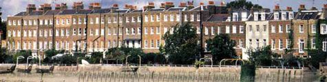
Walker's new office and house were in Hammersmith Terrace, a riverside neighborhood in London that was also home to William Morris. The two men discovered shared interest in socialism and craftsmanship which led to a lifelong friendship. Both were active in the Hammersmith Socialist Society and were founders of the influential Arts and Crafts Exhibition Society. Walker was especially fond of the rare books known as incunabula, meaning they were printed before 1500.

A Leaf from a Bible printed by Nicolaus Jenson in 1476

According to the Emery Walker Trust, "A lecture given by Walker in 1888 at which he projected magic-lantern slides of photographs he had taken of 15th-century typefaces gave Morris the idea for the last great project of his life, the Kelmscott Press." Walker declined to be a partner in the press, citing "'some sense of proportion' and no capital to risk." (DNB) However, he acted as an unofficial advisor to the press throughout Morris' life.

The English Bible from the Doves Press

In 1900, Walker joined with bookbinder T. J. Cobden-Sanderson to found the Doves Press as a vehicle for the production of the "Book Beautiful." Unlike the productions of the Kelmscott or Ashendene presses, Doves books had no illustrations or decoration other than the occasional very simple hand-painted initial, as seen on the opening page of the Doves Bible, above. As Cave says, the Doves Press books, "completely without ornament or illustration, . . . depended for their beauty almost entirely on the clarity of the type, the excellence of the layout, and the perfection of the presswork."


A closer view of the Doves type


The Doves type, renowned for its beauty and readability, was designed by Walker, based on the typography of the 15th century Venetian printer Nicolas Jenson. The eccentric Cobden-Sanderson was not the easiest person to get along with, and in 1909 a bitter disagreement between the two founders caused Walker to leave the press. Cobden-Sanderson carried on alone until 1916 when, after shutting down the press, he committed one of the greatest crimes in the history of typography: he threw all of Walker's gorgeous Doves type into the Thames, so it could never be used by anyone else (particularly Walker).

The Ashendene Dante, printed in Walker's Subiaco type

Luckily, other examples of Walker's fine typograhics designs live on, notably in two fonts he designed for the Ashendene Press, the Subiaco (based on that of 15th century printers Sweynham and Pannartz, and the Ptolemy, based on 15th German type. However, as the DNB notes, "his great reputation among students of typography rests on a far wider basis, for he was keenly preoccupied with the appearance of the everyday book, and not only with its rich relations. It is scarcely too much to say that his influence, direct or indirect, can be discerned in nearly every well-designed traditional typographical page that now appears, and that to him more than to any other man the twentieth century's great improvement in book production in Britain was due. Walker's exacting taste demanded close, even typesetting, perfect harmony between text and illustration, and excellent materials."

Sir Emery Walker.
Photo courtesy of the Emery Walker Trust


The three ideal examples of modern typography are considered to be the Kelmscott Chaucer, the Doves Bible, and the Ashendene Dante. Walker inspired the first, printed the second, and designed the type for the third. He also went on to print an number of fine books at his own press, including a translation of Homer by Lawrence of Arabia. He was a modest man who did not trumpet his own achievements, and readers today who appreciate a well-designed page are unaware that they owe a debt to this genius of typography.

Tuesday, June 8, 2010

Typography Geeks and Font Snobs

 
Are you one of those people who check the colophon of the bestseller you just finished reading to see what type was used? Me too!! Do you also lose all respect for people who use Comic Sans in professional presentations? It's like we were separated at birth. Knowing geeks in both the book world and in the digital domain, I know people who will almost come to blows over typeface choices. There are situations where you cannot even bring up Comic Sans MS without starting a fight.

The most recent issue of the Fine Press Book Association's journal Parenthesis contains an article on typography design that made me think about typefaces designed by printers long dead that influence our lives today. When you pull down the font menu in your word processing program, you may see fonts named Caslon or Baskerville. Both are named for important English printers.

William Caslon (1692-1766) was an influential English typeface designer (and gunsmith) whose Caslon Foundry produced the type that was used for the first printed version of the Declaration of Independence. Variations of his attractive serif font are still in common usage.

Specimens of Caslon Typeface

John Baskerville (1706-75) followed in Caslon's footsteps, developing new styles of type and printing, and developing a process to make paper smoother and whiter, the better to display his crisp black type.


Remember John the next time you choose Baskerville Old Face from your font menu.

The Industrial Revolution in the 19th century resulted in mass produced typefaces and poorer quality printing that offended the sensibilities of some, among them William Morris, leader of the Arts and Crafts movement in England. Morris, seeking a return to the proud artisan tradition of such early printers as Nicolas Jenson and Sweynham & Pannartz, founded the Kelmscott Press to produce beautiful books printed with handset types he designed himself.


Kelmscott books were printed in three great fonts: Golden (designed for and named for Voragine's The Golden Legend), Troy, a black-letter or Gothic-style typeface, and Chaucer, the typeface used in Kelmscott's greatest production, Chaucer's Canterbury Tales.

Friends of Morris also founded private presses and designed their own typefaces. Charles Harry St. John Hornby and his wife Cecily established the Ashendene Press, where they resurrected the beautiful Subiaco typeface used by the early Venetian printers Sweynham & Pannartz.

The Ashendene Press Life of St Francis of Assisi


Type designer and illustrator Eric Gill worked at the Golden Cockerel Press, creating typefaces and woodcuts for what was the greatest private press in the period between the two world wars. When you review your font choices in your favorite word processing program, you are likely to see at least two of Gill's creations, Gill Sans and the lovely Perpetua, my personal favorite font.


Perhaps the greatest typography geek and font snob of them all was Doves Press founder Thomas James Cobden-Sanderson. C-S had already established a name for himself as a bookbinder when he decided to venture into printing as well. He collaborated with Emery Walker, an engraver who had an impressive collection of 15th century typefaces. Together they developed the beautful Doves type, one of the greatest typographic achievements of the modern age. Below is a picture of the opening page of the Doves Bible, one of the three greatest private press books (the other two being the Kelmscott Chaucer and the Ashendene Dante).


Like the classic English eccentric he was, Cobden-Sanderson decided he could not let his typeface be abandoned to the use of the undeserving when he shut down the Doves Press in 1916. Rather than let it fall into the wrong hands, he walked out onto Hammersmith Bridge in London and threw all of the type into the Thames.

The next time you find yourself cornered by typography geeks at a bookish cocktail party, all you have to do is say, "Which was better, the Subiaco type or the Doves?" You can safely slip away while the font snobs battle it out. Don't bother to thank me. Just avoid using Comic Sans in professional correspondence and I'll consider us even.
___________________

Images courtesy of WikiCommons.

 
Subscribe to BOOKTRYST by Email