Showing posts with label Woodcut Engraving. Show all posts

Friday, May 10, 2013

A Magnificent 16th Century Woodcut On Perspective

by Stephen J. Gertz


The above woodcut, one of the most dramatic of the sixteenth century, is the variant title-page to the first edition of Daniele Barbaro's La Practica della Perspectiva, a virtual summary of contemporary architectural theory and the first systematic treatise on the practical applications of perspective, published in Venice by Borgominieri in 1569.

It's geometrical representation of a mazzocco, or interlaced ring in perspective, surrounded by satyrs and cherubs with drawing instruments.
 
The first edition of La Practica della Perspectiva was published in two issues, identical except for the date of imprint (1568 for first). Some copies of either issue also contain this variant title-page. A copy that has recently come into the marketplace, for example, is a second issue with the variant woodcut title page. Although this more dramatic title-page is found in both issues, it is far less common in the marketplace.

Many of the schematic woodcuts are closely related to Albrecht Dürer’s artist manuals, and the woodcuts of stage sets borrow from Italian Renaissance architect Sebastiano Serlio (1475-1552), who wrote eight books on architecture 1537-1575, and discussed the use of perspective in the theater in the second book of his Archtettura series, Le premier livre d’architecture... Le second livre de perspective, de Sebastian Serlio..., mis en langue francoise, par Jehan Martin... (Paris, Jean Barbé, 1545).
 
Barbaro (1514-1570) studied a variety of subjects including mathematics and natural sciences at the University of Padua. He had a diversified career: he was appointed for the creation of the research-oriented botanical garden in Padua, was a Venetian ambassador to the English court, and was made patriarch elect of Aquileia. He also directed the iconographic program for the ceiling of the Sala dei Consigli dei Dieci—frescoed by Paolo Veronese—at the Ducal Palace in Venice.
__________

BARBARO, Daniele. La Practica della Perspectiva. Venice: Borgominieri, 1569. First edition, second issue. Folio [340 x 210 mm]. 195 pp., (6) ff. Variant woodcut titlepage. Approx. 220 woodcut text illustrations. Bound in early vellum, with minor worming and chipping to covers, and title written in ink in an old hand on spine. Quire H4 (pages 57-64) is misbound as Ha, H, Hd, Hc, with all leaves present.

Fowler 36; Mortimer Italian, 39; Vagnetti E IIb23; Wiebenson III-B-7; Berlin Kat. 4694; Kemp, The Science of Art, 76-8; p. 189.  
__________

Image courtesy of Martayan Lan Rare Books, currently offering this title, with our thanks.
__________
__________

Wednesday, September 26, 2012

"Read, And Be Wise - Come, Read and Learn"

by Stephen J. Gertz


A scarce, early American abecedaire (ABC book) in battledore format has come into the marketplace. The Uncle's Present, A New Battledore, featuring "Cries" - street vendors who verbally announced their wares for sale - was issued out of Philadelphia in 1810. With cover woodcuts attributed to W. Mason and A. Anderson, it heralds "Read, and Be Wise" along the top cover's upper margin, and "Come, read and learn" along its flap. 


Within, twenty-four letters of the alphabet are illustrated with charming woodcuts depicting English Criers, including: a bookseller of almanacks, a broomseller, milkmaid, chicken-seller, a print (image) seller, lobster-seller, etc. "The Cries illustrating the alphabet are a very pretty set, and are probably an early set of Newcastle or York Cries by [Thomas] Bewick...The letteres J and U are omitted to have 24 letters in 24 compartments" (Rosenbach).

Unusual for battledores, an extra leaf is present featuring each woodcut for all the letters.


Battledores were popular reading aids for children in mid- to late eighteenth century grammar schools. With their emphasis on learning the alphabet in an entertaining and illustrated format, their popularity with children was enhanced by the form's secondary purpose: outside of the classroom the stiffcard booklet was used as a paddle to play an early version of badminton, battledore and shuttlecock. 

The Uncle's Present is scarce, with OCLC noting only five copies in institutional collections worldwide. A facsimile was reprinted in 1964.
__________

[BATTLEDORE]. The Uncle's Present. A New Battledore. Philadelphia: Published by Jacob Johnson, Sold by Benjamin Warner, n.d. [c. 1810]. First edition. Octavo (6 1/2 x 3 3/4 inches). Four leaves. Twenty-four woodcuts in twenty-four compartments. Brown pictorial stiffcard wrappers.

Welch 1363. Rosenbach 428.
__________

Images courtesy of Aleph-Bet Books, with our thanks.
__________
__________

Wednesday, April 11, 2012

Three Strange And Beautiful 16th Century Fantasy Maps, Another From 1617

By Stephen J. Gertz

MUNSTER, Sebastian. [Europe depicted as a Queen].
Basel, c. 1580. German edition. Colored. woodcut (260 x 160mm).
MCC I: 6.
During the late sixteenth century, a few cartographers designed and published a handful of maps with anthropomorphic countries and continents, with animal as well as human forms.

Sebastian Munster's created this famous example, a map of Europe that depicts the continent as a queen. The head represent Iberia, Denmark the left arm and Italy the right with Sicily an orb in her hand. The British Isles are shown, but not integrated into the figure. The map originally appeared in Munster's Cosmographei (1550).

BÜNTING, Heinrich. Asia Secunda pars Terræ in Forma Pegasir.
Magdeburg, 1581. German edition. Colored woodcut (300 x 370mm).

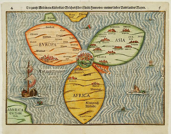
In the famous fantasy map depicting Asia as Pegasus, the winged horse of Perseus, the head is Turkey and Armenia, the wings Scythia and Tartary, forelegs Arabia, hind legs India and the Malay Peninsula. The map appears in Bünting's Itinerarium, in which the author, a theologian, rewrote the Bible as a travelogue, with other fantasy maps including the World as a cloverleaf.

BÜNTING,H. Die gantze Welt in ein Kleberblatt
Magdeburg, ca. 1581. Colored woodcut.
Shirley, World 142.

 And here it is. This extraordinary curiosity is referred to as the Clover-leaf, for obvious reasons. Heinrich Bünting's design was inspired by the trefoil form of the arms of Hanover, his native town. Despite the map's unusual appearance the fact that Jerusalem appears at the centre leans strongly on the tradition of medieval world maps. Bünting's work Itinerarium Sacrae Scriptura...was essentially a theological commentary with other maps of great curiosity.

VAN DEN KEERE, Pieter. Leo Belgicus.
Amsterdam, 1617. Colored engraving.
Van der Heijden, Leo Belgicus 4.2.

Pieter Van Den Keere's Leo Belgicus is, perhaps, the most celebrated example of cartography as patriotic expression. The lion had long been a national symbol of Holland and Belgium. Indeed, most of the coats-of-arms of the countries' seventeen provinces feature a lion. The map was a statement of unity, since at the time the seventeen provinces comprised a single nation, although under the control of Spain.

Van den Keere (Kaerius) was one of the most skilled Flemish engravers of the early seventeenth century. The Leo Belgicus is perhaps his finest work, its rich ornamentation includes three couples along the bottom in the characteristic dress of Friesland, Holland, and Belgium.
__________

First three images courtesy of Altea Gallery Antique Maps, Sea Charts, Atlases & Globes, with our thanks.

Image of Leo Belgicu courtesy of Barry Lawrence Ruderman Antique Maps, with our thanks.
__________
__________

Tuesday, November 30, 2010

The Art of Old Ream Wrappers, Unwrapped

by Stephen J. Gertz

Packing paper in bales
Reproduced from an engraving by Jan Luyken (1647-1712)

One of the little known yet  fascinating aspects of papermaking occurred after the paper was manufactured, when the finished sheets were collected and pressed into quires (25 folded sheets), the quires collected and pressed into a ream (20 quires), and the reams, wrapped in cheap paper and tied-up with cord, collected into bales of ten to fourteen reams (depending upon the size and weight of the paper) each for shipment to the end customer, printers. Paper was expensive; it needed to be carefully packaged, particularly for export.


Abraham Janssen, Puymoyen mill, Angoumois, France
c. late 16th century.
Note reams tied-up.
"Foolscap" was the standard size sheet of the era.
"I.M." is likely the master papermaker, Jean Morineau.

Maastricht collection, No. 4

The paper used to wrap the reams was typically printed with an identifying manufacturer's mark, which generally stated the name of the maker, the quality of the paper, often specific mill, etc. The design of the printmark was sometimes identical to the maker's watermark. The earliest used woodcut engravings, the later copper- and steel-engraved illustrations. Great care and pride were invested in the creation of ream wrapper marks. They are the wine labels of the world of old paper.

Adriaan Rogge, Zaanland, Holland
Copper engraving by Jan Stam, c. 1790
The lion represents the Republic of Holland,
the seven arrows its seven provinces

Collection of Henk Voorn

Most marks of French paper makers are in red, and  Dutch and Swiss ream wrappers are printed in either red or black. The paper itself can be white or blue. The artists are almost always unknown. There has been some question about whether the marks were printed by commercial printers or by the paper makers themselves. The evidence leans toward commercial printers. It cost the papermaker nothing; the printer was paid in paper.

Pierre Dexmier, Angoulême, France
c. 1695-1700
The lion and unicorn in the Amsterdam armorial
device designate sale to England and Scotland
through a Dutch paper merchant.

Amsterdam collection, No. 46

"The paper mill label or ream wrapper has become a collector's item, as well as an item of historical significance. The pictorial art depicted on the labels has provided historians with a view of both the interior and the exterior of these extinct mills, including employees at work, equipment and the basic layout of the mill and its surrounding lands" (Tracy Putzel-Bischoff, Ream Wrappers at the American Antiquarian Society).

John Savels, Gardiner, Maine, USA
1823.

 Collection of Henry Morris.


Isaac van der Putte, Amsterdam
c. 1720.
Ready-wrapped reams are clearly illustrated.
Haarlem Collection No. 50.

"It is difficult to state whether ream-covers should be considered rare. Some public archives boast important collections, but it is not easy to build a private collection since they are seldom offered for sale. Some types of prints or certain names of papermakers, are often met with. Of other ream-covers only a single copy is known, and of course there may have been thousands of different types which have completely disappeared. It requires great patience and ingenuity to assemble a more or less representative collection. The number of important collections in this field is very small, and a private collection of more than twenty-five European ream-covers is an exception" (Voorn, p. 25).

Jan Kool & Company, Zaanland, Holland
The Bonsem Mill, c. 1800

Zaanland Museum

"We may collect ream-covers simply out of curiosity, or because they are rare and sometimes interesting relics of the past.. but the chief reason would probably be artistic or historical interest...As rare specimens of folk art, ream-covers are worthy of our attention" (Voorn, p. 27). Collectors of Americana should find those from the U.S. of keen interest.

Isaac Flagg, Exeter, New Hampshire, USA
Drawing by M. Colbath, engraved by H.E. Baldwin c.1833
Established in 1777, the first paper mill in New Hampshire

Collection of Henry  Morris.

An interesting tangent: It is common to find within an old book some variance in paper quality; a thin leaf amongst thicker and finer paper, etc. (though this is often unnoticed or ignored by dealers, curators, and collectors). Why this is so becomes clear when a common practice while collecting the quires into reams for shipment is understood.

Peter Duering, Basle, Switzerland
Double ream wrapper, 1638

Amsterdam collection, No. 41

To provide extra protection for the finest quality papers, cheaper papers were placed on the top and on the bottom of the ream. It was typical for a printer to simply grab a sheet from a ream without being too fussy about whether it was the finer or lesser quality paper.  Having just picked up this factoid two weeks ago, I now see it in practice with just about every pre-19th century book I handle. You will, too.

Peter Smidt van Gelder, Zaanland, Holland
c. 1810
This mark possesses the initials of the mill's original
owner, Maarten Schouten. Van Gelder, the most
famous name in papermaking, is still in existence,
and is currently Holland's largest paper manufacturer
 
Haarlem collection No. 3

Ream wrappers are amongst the most ephemeral of book ephemera. They were routinely thrown away; there was no reason for the printer to save them after opening a ream. Yet these pieces of paper, at the time of their creation destined to be scrunched up into a ball and filed in a wastepaper basket, or used for scrap, provide all that we look for in a collectible book beyond its content: history, artistry, typography, and binding. Ream wrappers remain a key chronicle of old papermaking and the paper trade.
_________

Essential print references:

VOORN, Henk. Old Ream Wrappers. An Essay on Early Ream Wrappers of Antiquarian Interest. North Hills, PA: Bird & Bull Press, 1969. Limited to 375 copies on hand-made paper.

WEEKS, Lyman Horace. A History of Paper-Manufacturing in the United States, 1690-1916. New York: Lockwood Trade Journal Co., 1916.

Online:

Ream Wrappers at the American Antiquarian Society.

Inventory of American Antiquarian Society Collection of Ream Wrappers.

__________

Images reproduced from Voorn.

With thanks to Charlene Matthews for the lead.
__________
__________
 
Subscribe to BOOKTRYST by Email