Showing posts with label Cubism. Show all posts

Tuesday, May 14, 2013

Seven More Stunning Modernist Posters

by Stephen J. Gertz


More from Swann Galleries' Modernist Posters sale, held yesterday.

James Harley Minter designed this poster, Bal Pa'Pillon, in 1931 for The Kokoon Club of Cleveland, Ohio, founded in 1911 by Carl Moellman and William Sommer, young American artists inspired by the Dadaist movement and similar avant-garde organizations in Europe, and modeled after New York's Kit Kat Club. The club held annual costume balls, which began in 1913 and continued through 1938.

"This decadent, cubist-influenced image is an electric, microcosmic view of Cleveland's avant-garde artistic community. Presaging the psychedelic posters of the 1960s and reflecting many of the concurrent graphic art trends in Europe, this poster, and the entire series for the club's yearly balls, are bright, bold, daring and stand out as exciting and innovative examples of American design. Each poster also served as an invitation to the event, with the invitee's name written in across the bottom" (Nicholas D. Lowry). I hope Margaret Brennan had as much fun at this soirée as I did viewing its poster.

I am pleased to report that the head-snapping whiplash I experienced after learning that Cleveland possessed an avant-garde artistic community has been successfully treated via review of gangbuster Elliot Ness's checkered career as Cleveland's Public Safety Director followed by an unsuccessful run for mayor of Cleveland in 1938. I have no snobbish animus toward Cleveland; I simply had no idea that the city possessed a hip culture. 

For more about The Kokoon Club of Cleveland, including a survey of other gorgeous posters for its costume balls go here.


For Viaggiate Di Notte (1930), designed by famed graphic artist Adolphe Mouron Cassandre (1901-1968) for Wagons Lits (a railroad sleeping car company),  the artist chose an "unquestionably persuasive" (Mouron p. 69) symbolic and poetic approach to advertising.

"The breathtakingly simple device of a red light glowing in the foggy darkness of a railroad siding is perfectly consistent with our poetically charged experience of looking out the window of a speeding night express" (op cit, Mouron).

"It is an elegant and inviting approach, evoking travel by night. The poster exists with different text variants, but this one is the least cluttered. This is also the rare Italian version. We could locate only one other copy in the collection of the Suntory Museum in Japan" (Lowry).


Cassandre, again. Turmac / La Cigarette is one of his earliest posters, designed in 1925. "It predates the time when his work began to reflect his radical and ingenious design theories. He employs a sensuous approach which doesn't appear again in his work until 1937, when a similar smoldering cigarette is featured in his poster for Sensation Cigarettes. Nevertheless, it also foreshadows some of his subsequent graphic finesse: within the stylized smoke and the outside border, he plays with the interchange between shades of blue, white and black in a manner that presages his typographic work in later posters such as Pivolo, Nord Express and Étoile du Nord. The actual typography on this poster is an exceptional mix of Art Deco and the Arabesque. We have not found another copy at auction for the past 30 years" (Lowry). 


Jac Leonard (1904-1980), a Canadian artist, created Beware The Walls Have Ears c. 1940, It's one in a series of posters printed by Canada's Wartime Information Board, similar in aim and approach to those published by the American War Office in its Careless Talk Kills series issued during World War II.

A swastika-eyed secret villain, photo-montage, bold, bright typography and powerful imagery - this progressive design has it all and makes its point as firmly as a hammer to the noggin.


Edgar Scauflaire (1893-1960) was a Belgian artist who studied at the Académie des Beaux Arts in Liége, where he was born. Many of his paintings clearly reflect the influence of Picasso and Braque. He also designed murals and tapestries. This Art Deco-inspired, aquatic allegory is one of at least two posters used to promote the International Exposition de L'Eau of 1939.


After studying art at the Munich Academy under Julius Diez and Angelo Jank, Hermann Keimel (1889-1948) went on to become a teacher at the same institution. He was a member of the artistic group "The Twelve," and also of the new Munich Association of Poster Artists. He designed numerous commercial posters, generally employing a crisp Art Deco style. Muenchner / Plakat Kunst (1931) is his masterpiece and remains an icon of poster self-promotion: to promote an exhibition of Munich poster art Keimel constructed this cubist face out of colored sheets of printing paper.


Manilo Parrini (1901-1968) created this striking aeronautical-themed poster for the 3d International Aircraft Exhibition held in conjunction with the Milan Trade Fair of 1939.

He worked during Mussolini's regime in Italy, which is to say in a monumental, over the top, grandiose glory of Rome epic style, light on subtlety; the anvil school of messaging. Here, in a Fascist salute to Il Duce, he incorporates a trio of fasces on the tail fin of the plane in the foreground, while the three planes in the distance are streaming the colors of the Italian flag behind them.

In case anyone misses the symbolism of fasces on the tail, it's a visual representation of baciarmi il  Fascista culo,  if not an official, explicit political slogan, a casually implicit one.
__________

Réne Magritte designed posters and sheet music? Stop by Booktryst tomorrow for the story.
____________

Images courtesy of Swann Auction Galleries, with our thanks.
___________
___________

Monday, October 10, 2011

The Picasso of Dust Jacket Design

by Stephen J. Gertz

1952.

He brought poster, advertising, and dust jacket design out of the nineteenth century and into the twentieth, integrating the aesthetic and forms of modern art into his work. It was welcomed in England. It was rejected in the United States. In his time he was, ultimately, the most significant graphic designer in the English-speaking world.

1929.

Born in Montana, USA, E[dward]. (“Ted”) McKnight Kauffer (1890-1954) was one of Europe's most prolific and influential advertising poster artists during the 1920s and 1930s, and as innovative as his French counterpart, A.M. Cassandre. His dust jacket designs are no less celebrated. At a time when marketers preferred simple, representational designs heavy with copy, he took another direction. His dust jackets are highly coveted by rare book collectors.

1935.

This "American designer and painter...was active in England...studied painting first, at evening classes at the Mark Hopkins Institute, San Francisco (1910–12), at the Art Institute of Chicago, with lettering (1912), and in Paris at the Académie Moderne (1913–14). In 1912 he adopted the name of an early patron, Professor Joseph McKnight (1865–1942), as a gesture of gratitude. In 1914 he settled in Britain.

1951.

"From 1915 McKnight Kauffer designed posters for companies such as London Underground Railways (1915–40), Shell UK Ltd, the Daily Herald and British Petroleum (1934–6). One of his master works, Soaring to Success! Daily Herald—The Early Bird (1919), was derived from Japanese prints and from Vorticism. In 1920 he was a founder-member of Group X with Wyndham Lewis and others. McKnight Kauffer’s designs included illustrations for T. S. Eliot’s Ariel Poems [London, 1927–31, printed by the Curwen Press] and for publications by the Nonesuch Press and Cresset Press, using the pochoir process of coloured hand-stenciling; he also designed photomurals, ephemera such as luggage labels; and theatre and ballet costumes and sets, including Checkmate (1937)...
 
1928.

1929.

"He made skillful use of the airbrush and the montage technique, often applying his knowledge of modern art movements such as Constructivism and Surrealism. In 1940 he went to New York, where he designed posters for war relief agencies, the United Nations and American Airlines (1946–53), as well as many book jackets and illustrations" (Mark Haworth-Booth, Grove Art Online, 2009).

He struggled in New York. It was a highly competitive environment for commercial artists and advertisers were not as open to his work as they were in Britain.

Union of Democratic Control, 1933.

In a review of one of his frequent exhibitions during the Thirties, Kauffer was referred to as the “Picasso of Advertising Design...Mr. McKnight Kauffer is an artist who makes one resent the division of the arts into major and minor" (Anthony Blunt).

Putnam, 1936.

1938.

From 1928 through the early 1950s,  Kauffer designed thirty-one dust jackets for the Modern Library,  including: Sherwood  Anderson's Winesburg Ohio; Edward Bellamy's Looking Backward; Arnold Bennett's The Old Wive's Tale; Boccaccio's Decameron; Samuel Butler's The Way of All Flesh; Cervantes' Don Quixote; Clausewitz's On War; Du Maurier's Rebecca; Falkner's Sanctuary, Light in August, and Go Down, Moses; Theophile Gautier's Mademoiselle de Maupin; Hammett's The Maltese Falcon; Hemingway's The Sun Also Rises; W.H. Hudson's Green Mansions; Huxley's Point Counter Point; Henry James' Portrait of a Lady; D,H. Lawrence's Women in Love;  Maurois' Disraeli; Moby Dick; Palgrave's Golden Treasury; The Best of S.J. Perelman;  Rabelais; Spaeth's Guide to Great Orchestral Music; Dracula; Sterne's Tristam Shandy and A Sentimental Journey; Arthur Symonds' Life of Michaelangelo; Thackeray's Henry Esmond; Richard Wright's Native Son; and Young's The Medici.

M.Secker, 1923.

1949.

 "In Kauffer's hands the poster (or the book jacket, which for him was a mini-poster) was designed to be interpreted rather than accepted at face value. In this regard he continually struggled with the paradox of how to meet his creative needs, his clients' commercial interests and his viewers' aesthetic preferences, all in a limited period of time. In a speech before the Royal Society of Arts in 1938 ...Kauffer candidly explained his methodology and resultant angst:

Great Western Railway Company, 1934.

1934.

"'When I leave my client's office, I am no longer considering what form my design or my scheme will take, but the urgent fact that I only have so much time in which to produce the finished article. I find this irritating, and am often overcome by a feeling of hopelessness about the whole business. On my way home I think, Will my client understand what I propose to do? Will he understand I may not give him an obvious, logical answer to his problem? Does he suppose I have magical powers, or does he believe that I can solve his sales problem as simply as one might add two and two together and make four?

1928.

1948.

"'I have now reached my studio. I pick up a book. I lay it down. I look out of the window. I stare at a blank wall, I move about. I go to my desk and gaze at a blank piece of paper. I write on it the names of the product. I then paint it in some kind of lettering. I make it larger—smaller—slanting—heavy—light. I make drawings of the object—in outline, with shadow and color, large and then small—within the dimensions I have now set myself''" (Citation, American Institute of Graphic Arts Medal, 1992).

Random House, 1949.

1928.

“Most advertising artists spend their time elaborating symbols that stand for something different from the commodity they are advertising. Soap and refrigerators, scent and automobiles, stockings, holiday resorts, sanitary plumbing are advertised by means of representations of young females disporting themselves in opulent surroundings. Sex and money—these would seem to be the two main interests of civilized human beings. 

1930.

1940.

"McKnight Kauffer prefers the more difficult task of advertising products in terms of forms that are symbolic only of these particular products. Thus, forms symbolic of mechanical power are used to advertise powerful machines; forms symbolic of space, loneliness and distance to advertise a holiday resort where prospects are wide and houses are few. In this matter McKnight Kauffer reveals his affinity with all artists who have ever aimed at expressiveness through simplification, distortion and transportation (Aldous Huxley, Introduction to Posters by E. McKnight Kauffer,  Museum of Modern Art exhibition catalog, 1937). 

1944.

Kauffer's difficulties in in New York continued through 1947. It was then that he began to design posters for American Airlines, his biggest client until his death in 1954, and the work that finally brought him the commercial success in the U.S. he so desired.

E. McKnight Kauffer, photograph by Howard Coster, 1927.

Kauffer has always been highly collectible. His visually arresting and compelling designs remain as fresh and dynamic as when originally executed.
__________

See an excellent survey of the Modern Library dust jackets of E. McKnight Kauffer.

Dust jacket images courtesy of  Flickr, particularly Peacay's Photostream.
__________
__________

Wednesday, October 5, 2011

Five Great 20th Century Bindings

by Stephen J. Gertz

Five exquisite bindings recently jumped out of a rare book dealer's catalog, grabbed my eyes and wouldn't let go. Now I'm blind-stamped and bowled-over by them but can't complain; "it is beauty that captures your attention" (Oscar Wilde). It'll capture yours, too.


BRAQUE, Hesiode. Theogonie. Eaux-fortes de Georges Braque. Paris: Maeght Editeur, 1955. Limited to 150 copies o papier d'Auvergne à la main, signed by Georges Braque. Folio. 78 pp. Twenty original etchings (seventeen full page).

Full dark chocolate crushed morocco by Cubism/Surrealism-influenced binder, Paul Bonet (1889-1971), arguably the most celebrated  French binder of his era, with his signature gilt, large curvilinear excised section from front and rear boards with onliad black and white polished calf sections and additional onlaid sections of shaded yellow and green crushed morocco to form two large vignette motifs, onlaid title to spine in Greek, yellow and green suede doublures.

"Born in Paris in 1889 to Belgian parents, Bonet rose to become the leader of French binders. Two particular styles of his work are known as "irradiante," which consists of massed gilt lines giving a three-dimensional optical-illusion effect, and "rayonnante," a sun-burst effect" (Morgan Library).


ALBISOLA, Tullio (poet and designer). MUNARI, Bruno (illustrator).  Poeti Futuristi. L'Anguria Lirica. Presentazione di [Filippo Tommaso]  Marinetti. Roma: Edizioni Futuristi di Poesie, 1934. Limited to fifty copies for sale, of a total edition of 101. Square octavo. Twenty-one metal leaves with lithographic text by d'Albisola and eleven color lithographed plates by Bruno Munari. Typography and mise en page by d'Albisola.

One of three rare and important Futurist metal books (the first, Parole in libertà futuriste, tattili-termiche-olfattive, published in 1932; Libro di latta aggressivo e contundente, published in 1933), a monument to Futurist book production. Binding in full lithographed metal by  Lito-Latta Nosenzo of Savona, a manufacturer of metal storage boxes, after design by Albisola.


MAILLOL, Aristide. HORACE. Odes d'Horace. Texte Latin et Traduction en Vers par le Baron Delort. Gravures sur Bois d'Aristide Maillot. Paris: Philip Gonin, Editeur, 1939.  One of fifty édition de tête copies on papier de chanvre et lin with a suite of all the plates in black and a suite in color, initialed by the publisher on the colophon of each volume and on the wrappers to each suite. Two octavo volumes. 179; 278 pp. Frontispiece,123 woodcut text illustrations.

Full green polished calf by Pierre-Lucien Martin (1913-1985), boards and spines with onlaid section of pale green calf to form two-tone mirrored decorative scheme.

"Pierre-Lucien Martin (1913-1985) ranks high among the outstanding French design binders of the last half century. Trained at the École Estiènne in Paris, he gained experience in several binderies before emerging as a designer in his own right after World War II. His designs are characterized by understated color, impressive three-dimensional effects, and intricate but highly logical applications of geometry" (Six Centuries of Master Bookbinding at Bidwell Library).


ERNST, Max. PÉRET, Benjamin. Je Sublime. Paris: Editions Surrálistes, 1936, 30 June. One of twenty-five hors commerce numbered examples on papier le Roy Louis' tiente Normandie, of a total edition of 241 copies. Octavo. 24 ff. Four original color frottages on cream paper by Max Ernst.

Full white crushed morocco with alligator patterning by Georges Leroux, ruled in blind and applied in cross-grained sections, boards with onlaid lozenges as eyes with applied sections of white and green morocco as pupil and iris, title to spine in green and black.

Georges Leroux (1922-1999), one of the most accomplished and esteemed French binders of the twentieth century, began his career as a poet before becoming a binder in 1959. Marked by the use of exotic materials, inset metal plaques and strong polychromatic color, books from the early stage of his career (as here) were designed and executed (rather than simply designed) by Leroux.


SCHMIED, François-Louis (illustrator and binder). MARDRUS, J.C. Le Livre de la Verité de Parole. Transcription des Textes Egyptiens Antiques. Paris: Chez F.-L. Schmied, 1929. :Limited to 150 copies signed by Schmied, with two suites of the illustrations on Japon, in b&w and color. Quarto. Twelve wood cut illustrations.

Bound in full Jansenist brown crushed morocco by François-Louis Schmied (1873-1941) over beveled wooden boards, with doublures in matching morocco, each decorated with a inlaid lacquer panel, the first representing a falcon in salmon and gold, the second an eagle with wings spread above orange flames, each lacquer panel bordered by inlaid gold bands, with a double set of silk endpapers, one aubergine, the other cardinal red.

"Francois-Louis Schmied [was] a highly accomplished printer [publisher/binder/illustrator] best known today for his de luxe editions of classic works of literature…Based in Paris in the 1920s and 1930s and in Morocco in the late 1930s…, Schmied's books' sumptuousness defies easy description and evidences a singular mastery" (Garabedian, M. The Printer in Paris).

"On their first exposure to one of François-Louis Schmied's productions, most Americans…are apt to declare that they have never seen anything like it" (Tabor, S. The World From Here: Treasures of the Great Libraries of Los Angeles, p. 136).
__________

Images courtesy of Sims Reed Rare Books, with our thanks.
__________

Of related interest:

Three Must-See Bindings.

Three More Must-See Bindings.

Five Must-See Modern French Bindings.
__________
__________

Wednesday, September 29, 2010

Poetry On Canvas: The Art of E.E. Cummings

by Stephen J. Gertz


Marion Morehouse in Gray-Green
Original oil sketch on cardboard, 8 1/2 by 11 1/4 inches, of Cummings' third wife,
Marion Morehouse. Her fully realized face peers out from gray-green background
and lightly indicated body. LPC #46. Lopez #1105.
While most of us are aware of e.e. cummings as a modern poet, who, amongst other innovations, integrated typography into his poems, many may be unaware of his work as a visual artist.

Marion Morehouse in Gold and Dark Gray
Original oil painting. Oil on canvasboard, 10 by 14 inches.
Portrait of Cummings' third wife, Marion Morehouse.
She is depicted to the waist with her arms crossed in sketchy
 brushstrokes against a dark gray background. Her skin tone
is indicted with lines of pale gold paint. LPC #732. Lopez #1091.
He considered it as important as his writing and devoted an enormous amount of energy to it.

Portrait of Marion Morehouse
Original oil painting. Oil on canvasboard, 10" x 14".
Portrait of Marion Morehouse, Cummings's third wife;
she is nude to the waist and posed with her arms raised
with her hands behind her neck. LPC #731. Lopez #561.
He began to paint at about the same time as he began to compose poems, in the immediate post-WWI years, and followed the avant-garde currents of Cubism and Abstraction. Later, however, he turned his back on the artistic establishment and, while integrating the principles he had explored in modernism, settled into a distinct and highly personal relationship with the representational and human. Yet, he maintained an exuberant and uninhibited approach to color; he had written extensively on color theory and it appears as if his retinas were drunk, their rods and cones guests at a chromatic orgy.

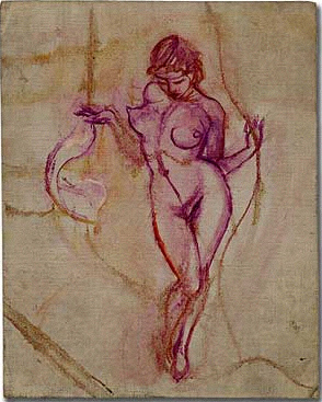
Sketch of Dancing Nude
Original oil sketch. Oil on canvasboard, 8" x 10".
Light brushed sketch of dancing nude woman,
using mostly purple paint. LPC #785. Lopez #880.
"Why do you paint? For exactly the same reason I breathe. That's not an answer. There isn't any answer. How long hasn't there been any answer? As long as I can remember. And how long have you written? As long as I can remember. I mean poetry. So do I" (e e cummings).

Kneeling Nude
Original oil painting. Oil paint on cardboard, image size 6 by 8 1/4 inches,
 matted in board frame, 16 by 20 inches. Thickly painted study of
kneeling female nude in impressionistic forest setting. Dated on the
 verso "Aug 18 1940." LPC #368. Lopez #1136
"Critics have generally divided Cummings' career as a painter into two stylistic phases. The first phase, about 1915-1928, was represented by his experimental large-scale abstracts and his drawings and caricatures published in The Dial. During the 1920s Cummings started to drop out of the gallery scene, and he came to view the art establishment as anti-intellectual. The second phase of his art was from about 1928 until his death; this phase was characterized by representational works: still lifes, landscapes, nudes, and portraits" (Harry Ransom Center biographical sketch).

Sitting Blonde
Original oil painting. Oil on cardboard, image size 8 by 17 inches,
matted in board frame, 15 by 25 inches. Study of seated blonde nude
with her arms upraised. LPC #375. Lopez #1045.
"A distinct throat. Which breathes. A head: small, smaller than a flower. With eyes and with lips. Lips more slender than light; a smile how carefully and slowly made, a smile made entirely of dream. Eyes deeper than Spring. Eyes darker than Spring, more new . . . These, these are the further miracles . . . the breasts. Thighs. The All which is beyond comprehension - the All which is perpetually discovered, yet undiscovered: sexual, sweet, Alive!" (e e cummings).

Standing Nude with Red Scarf
Original oil painting. Oil paint on cardboard, image size 8 by 13 1/2 inches,
matted in board frame, 16 by 20 inches. Study of standing female nude with
blonde hair, holding a red scarf. Dated "3-4-45" on verso. LPC #346. Lopez #1137.
"In viewing the art of e. e. cummings, it's tempting to say he was even more of an artist than a writer, especially inasmuch as his art seems easier to digest than his writings. In fact, indications are, he devoted much more time to his art. cummings was a purist when it came to his art. He viewed representational painting as more of a challenge than abstraction, calling those who worshipped Picasso as "super submorons" who ignored the fact that their hero himself had once declared that there was no such thing as "abstract" painting, crying out instead for artists to "respect the object." Whether painting in a representational or non-representational manner, Cummings rose above even that. He painted more than 'things.' He painted art, and always generously imbued it with the power of reasoned of aesthetics" (Lang, Jim. E.E. Cummings, the Artist. At Humanities Web).

Standing Female
Oil on cardboard Size: 8-1/2" x 14"
Dated: 1945-05-27. Lopez #1164.
"Your poems are rather hard to understand, whereas your paintings are so easy. Easy? Of course - you paint flowers and girls and sunsets; things that everybody understands. I never met him. Who? Everybody. Did you ever hear of nonrepresentational painting? I am. Pardon me? I am a painter, and painting is nonrepresentational. Not all painting. No: house painting is representational. And what does a house painter represent? Ten dollars an hour. In other words, you don't want to be serious -   It takes two to be serious" (e e cummings).

Cummings did not enjoy being categorized. Poet, painter, abstractionist, representationalist - it was all the same to him. It was art, and art defies category.
__________

The above is but a small sample of Cummings' artwork; he was extremely prolific as a painter.

Images courtesy of Between the Covers, with the exception of Standing Female courtesy of Ken Lopez. The paintings are currently offered for sale by both dealers.

Bookseller Ken Lopez has established a website-gallery dedicated to the paintings of e.e. cummings.

The Harry Ransom Center has posted their inventory of Cummings' artwork here.
__________
__________
 
Subscribe to BOOKTRYST by Email