Showing posts with label Art Deco. Show all posts

Tuesday, May 21, 2013

Réne Magritte, Poster & Sheet Music Artist

by Stephen J. Gertz


"Ceci n'est pas une pipe." Yes, it's not a pipe, it's a poster. By Réne Magritte (1898-1967), known for his excursions into surrealism and "the treachery of images," his 1929 masterpiece, Ceci n'est pas une pipe, an icon of modernism and one of the most recognizable works of art of all time.

But before his explorations of the landscape of the mind, he worked as a commercial graphic designer, creating, for example, over forty covers for sheet music during the 1920s in the Art Deco manner. And, as above, posters, this one, created later in his career for the Film and Fine Arts World Festival in Brussels 1947, integrating surrealistic mind play into the composition.

Here, a woman is in the foreground to a movie screen, her forehead itself a screen: men project upon a woman a narrative they imagine, which may or may not reflect the reality of the woman's inner life and desires.

Magritte spent a large part of his life working in advertising, both to help sustain himself during lean times, and out of an interest in publicity.

He re-used the above image in 1949 for the second of these film festivals. This is the scarce smaller format.

These examples of Magritte's graphic work were part of Swann Galleries' Modernist Posters sale held this past Monday, May 12th.


Magritte designed the cover of the sheet music to L'Heure du Tango in 1925 for Brussels publisher L'Art Belge. 


The sheet music for Valse d'Amour, with it cover by Magritte, was published in 1926 by L'Art Belge.


Elle A Mis Son Smoking was also published 1926, it, too, issued by L'Art Belge.

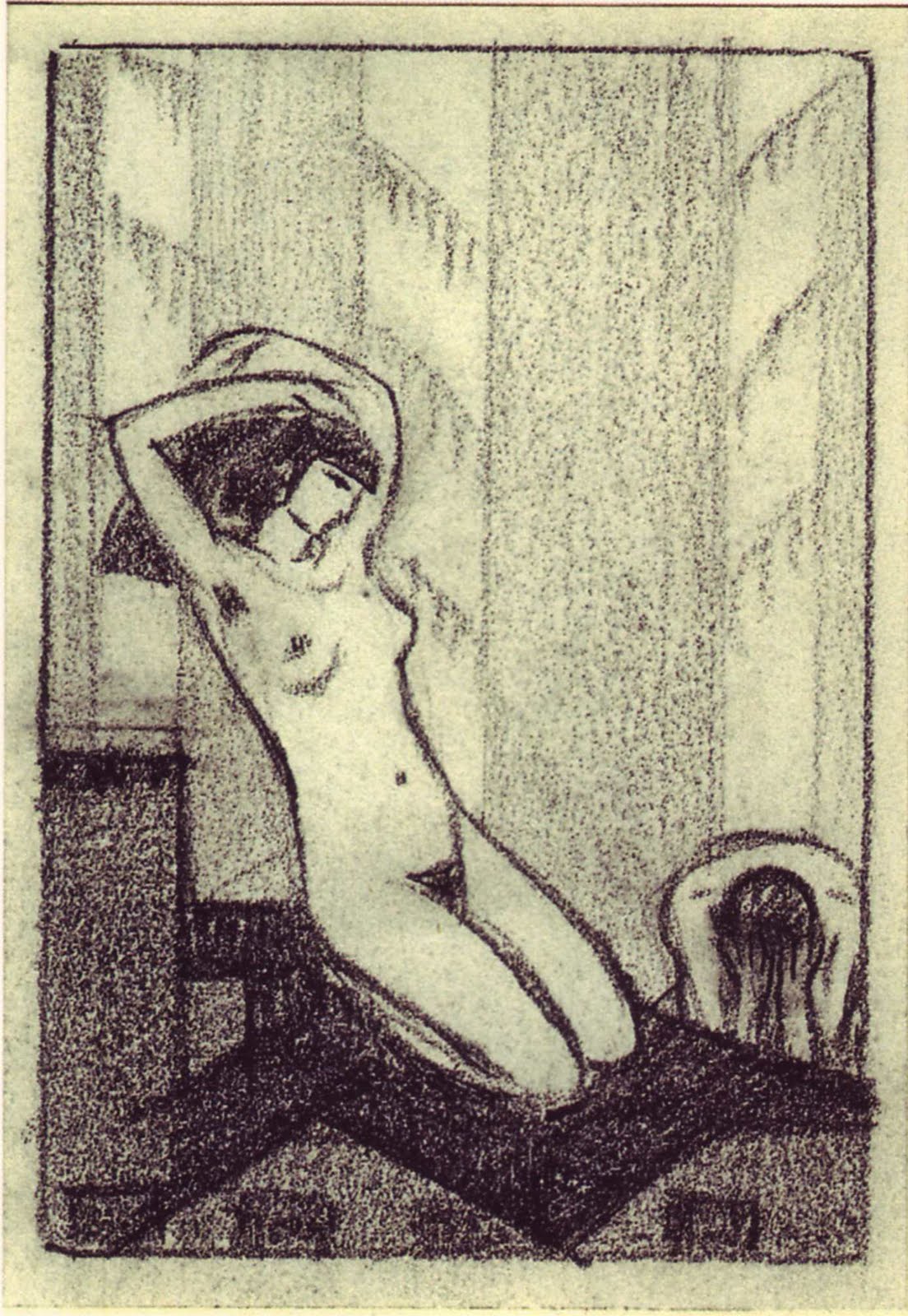
Magritte's earliest oil paintings, dating c. 1915, were Impressionistic in style. His oil paintings 1918-1924 were influenced by Futurism and by the offshoot of Cubism practiced by Metzinger.  Female nudes dominate this period in his work.

Magritte worked as a draughtsman in a wallpaper factory 1922-1923, and was a poster and advertisement designer until 1926, when a contract with Galerie la Centaure in Brussels made it possible for him to devote himself to painting full-time.

Magritte produced his first surrealistic painting, Le jockey perdu, in 1926. It, and others by the artist, were exhibited in Brussels in 1927 but met with critical scorn. Depressed by their poor reception, Magritte moved to Paris where he became friends with Andre Breton and became involved in the surrealist group.
___________

Images courtesy of Swann Auction Galleries, with our thanks.
___________
___________

Tuesday, May 14, 2013

Seven More Stunning Modernist Posters

by Stephen J. Gertz


More from Swann Galleries' Modernist Posters sale, held yesterday.

James Harley Minter designed this poster, Bal Pa'Pillon, in 1931 for The Kokoon Club of Cleveland, Ohio, founded in 1911 by Carl Moellman and William Sommer, young American artists inspired by the Dadaist movement and similar avant-garde organizations in Europe, and modeled after New York's Kit Kat Club. The club held annual costume balls, which began in 1913 and continued through 1938.

"This decadent, cubist-influenced image is an electric, microcosmic view of Cleveland's avant-garde artistic community. Presaging the psychedelic posters of the 1960s and reflecting many of the concurrent graphic art trends in Europe, this poster, and the entire series for the club's yearly balls, are bright, bold, daring and stand out as exciting and innovative examples of American design. Each poster also served as an invitation to the event, with the invitee's name written in across the bottom" (Nicholas D. Lowry). I hope Margaret Brennan had as much fun at this soirée as I did viewing its poster.

I am pleased to report that the head-snapping whiplash I experienced after learning that Cleveland possessed an avant-garde artistic community has been successfully treated via review of gangbuster Elliot Ness's checkered career as Cleveland's Public Safety Director followed by an unsuccessful run for mayor of Cleveland in 1938. I have no snobbish animus toward Cleveland; I simply had no idea that the city possessed a hip culture. 

For more about The Kokoon Club of Cleveland, including a survey of other gorgeous posters for its costume balls go here.


For Viaggiate Di Notte (1930), designed by famed graphic artist Adolphe Mouron Cassandre (1901-1968) for Wagons Lits (a railroad sleeping car company),  the artist chose an "unquestionably persuasive" (Mouron p. 69) symbolic and poetic approach to advertising.

"The breathtakingly simple device of a red light glowing in the foggy darkness of a railroad siding is perfectly consistent with our poetically charged experience of looking out the window of a speeding night express" (op cit, Mouron).

"It is an elegant and inviting approach, evoking travel by night. The poster exists with different text variants, but this one is the least cluttered. This is also the rare Italian version. We could locate only one other copy in the collection of the Suntory Museum in Japan" (Lowry).


Cassandre, again. Turmac / La Cigarette is one of his earliest posters, designed in 1925. "It predates the time when his work began to reflect his radical and ingenious design theories. He employs a sensuous approach which doesn't appear again in his work until 1937, when a similar smoldering cigarette is featured in his poster for Sensation Cigarettes. Nevertheless, it also foreshadows some of his subsequent graphic finesse: within the stylized smoke and the outside border, he plays with the interchange between shades of blue, white and black in a manner that presages his typographic work in later posters such as Pivolo, Nord Express and Étoile du Nord. The actual typography on this poster is an exceptional mix of Art Deco and the Arabesque. We have not found another copy at auction for the past 30 years" (Lowry). 


Jac Leonard (1904-1980), a Canadian artist, created Beware The Walls Have Ears c. 1940, It's one in a series of posters printed by Canada's Wartime Information Board, similar in aim and approach to those published by the American War Office in its Careless Talk Kills series issued during World War II.

A swastika-eyed secret villain, photo-montage, bold, bright typography and powerful imagery - this progressive design has it all and makes its point as firmly as a hammer to the noggin.


Edgar Scauflaire (1893-1960) was a Belgian artist who studied at the Académie des Beaux Arts in Liége, where he was born. Many of his paintings clearly reflect the influence of Picasso and Braque. He also designed murals and tapestries. This Art Deco-inspired, aquatic allegory is one of at least two posters used to promote the International Exposition de L'Eau of 1939.


After studying art at the Munich Academy under Julius Diez and Angelo Jank, Hermann Keimel (1889-1948) went on to become a teacher at the same institution. He was a member of the artistic group "The Twelve," and also of the new Munich Association of Poster Artists. He designed numerous commercial posters, generally employing a crisp Art Deco style. Muenchner / Plakat Kunst (1931) is his masterpiece and remains an icon of poster self-promotion: to promote an exhibition of Munich poster art Keimel constructed this cubist face out of colored sheets of printing paper.


Manilo Parrini (1901-1968) created this striking aeronautical-themed poster for the 3d International Aircraft Exhibition held in conjunction with the Milan Trade Fair of 1939.

He worked during Mussolini's regime in Italy, which is to say in a monumental, over the top, grandiose glory of Rome epic style, light on subtlety; the anvil school of messaging. Here, in a Fascist salute to Il Duce, he incorporates a trio of fasces on the tail fin of the plane in the foreground, while the three planes in the distance are streaming the colors of the Italian flag behind them.

In case anyone misses the symbolism of fasces on the tail, it's a visual representation of baciarmi il  Fascista culo,  if not an official, explicit political slogan, a casually implicit one.
__________

Réne Magritte designed posters and sheet music? Stop by Booktryst tomorrow for the story.
____________

Images courtesy of Swann Auction Galleries, with our thanks.
___________
___________

Friday, February 22, 2013

A Decadent Night in Paris With Georges Barbier - A Booktryst Golden Oldie

by Stephen J. Gertz

BARBIER, Georges. Le Grand Décolletage.
Le Bonheur du Jour, ou les grâces à la mode.
Paris: Chez Meynial, 1924

This past Saturday, alone and at loose ends, I called Lisette. She was, as ever, loose, so we made plans for the evening, a night on the town in Paris and pleasure.

I stopped by to pick her up. An hour later, she was still involved with her Grand Turning, transforming herself into a siren and I was duly alarmed. I just stood there, in awe. All I could think was, Aw, if there is a God, I’m under that dress by midnight..

BARBIER, Georges. La gourmandise.
Falbalas et Fanfreluches
Paris: Chez Meynial,1925

We stopped to sup. We had the soup. There was a fly in it. Performing a languid tarantella, as our waiter informed us when we asked what it was doing there, the fly, apparently, in the midst of an inter-insect identity crisis. Afterward, Jocelyn, Lisette’s special friend, stopped at our table to say hello and comment upon Lisette’s gown, which she had, at the last minute before leaving home, put on instead of the wearable, floral patterned yurt I’d planned on being inside of under cover of darkness and Lisette.

She asked about our meal. “It was fly,” we said, “super-fly.”

“And so are you, Lisette,” Jocelyn said. I looked into Lisette’s  eyes and saw what Jocelyn was talking about, a thousand tiny lenses looking back at me as if I was a granule of refined sugar. Sweet night ahead!

We asked Jocelyn to join us; we desperately wanted to stick together. But Jocelyn insisted that we remain single so that the three of us could continue into the evening without her feeling like a third wheel.

BARBIER, Georges. La Danse.
Modes et manièrs d'aujourd'hui
Paris: Maquet, 1914.

We wheeled over to Danse Macabre, the popular night-spot. A troglodyte manned the velvet rope. He refused us entry but I slipped him a mickey and he let us in before losing consciousness. “Always tip the bouncer,” I told the ladies as his head bounced on the sidewalk. We breezed in.

Lisette excused herself, and when she returned she was wearing yet another gown. I, during the interim, grew a mustache and put some eye shadow on. While Lisette and I  danced, Jocelyn drank the joy-juice flowing from the Chinese God’s phallic fountain into her champagne coupe full of cherries. Jubilee, my friend, a real jubilee it was.

You know me, Al. We danced until the cows came home. When they arrived it became too crowded  so we ditched the bovine for divine and further delights.

BARBIER, Georges. Le goût des laques (Taste of Lacquers).
Le Bonheur du Jour, ou les grâces à la mode.
Paris: Chez Maynal, 1924

Don’t ask me why but Lisette and Jocelyn had a  yen for a taste of lacquers so we stopped at a lacquer store, picked up a bottle and settled in a Japanese park comprised of a few vivid screen panels, just off the Champs-Élysée. They - once again! - changed their clothes, and the two of them huffed lacquer fumes while I stood aside and watched them get giddily shellacked. Jocelyn wandered off, we knew not where, led by the hallucinations she was now following in a trance.

BARBIER, Georges. Le Soir.
Falbalas et Fanfreluches
Paris: Chez Meynial,1926

“If you promise not to change your gown again I’ll take you to a palace of infernal pleasures,” I begged Lisette, now garbed as a goddess.

BARBIER, Georges. Oui!
Falbalas et Fanfreluches
Paris: Chez Meynial, 1921

“Oui!” she replied, but not before changing her outfit once more. I swear, she had a walk-in closet in her purse. She wasn’t a clothes horse; she was a clothes whale and craved fresh clothing, a lot of it, as if it were krill. A moment later, two birds shat on my spats. Auspicious omen! Time to evacuate and get this party started. So we both used the bathroom and then went on our way. Pops Marchande was waiting for us.

BARBIER, Georges. La Paresse (Laziness)
Falbalas et Fanfreluches.
Paris: Chez Meynial,1925

You know me, Al, most parties I wind up checking out the books in the library. So, I go into the library and, yikes!, there’s Lisette draped over pillows on the floor, to all appearances in a state of post-coital bliss,  lazily smoking a cigarette as if she had been doing it all her life instead of starting just fifteen minutes before when she donned a smoking pantsuit and was inspired by it to begin, despite the Surgeon-General's warning medallion on the front of the garment. Jocelyn, who had, apparently, followed her favorite hallucination, was at her side, spent, and lost in ecstatic reverie. 

That being the reason we attended Pops Marchande’s party in the first place, the three of us glided into the den.

BARBIER, Georges. Chez la Marchande de Pavols (House of the Poppy Merchant).
Le Bonheur du Jour, ou les grâces à la mode.
Paris: Chez Meynial, 1924

There was Pops Marchande, holding an opium tray and pipe, awaiting us. And sprawled on the floor and across pillows were five women in dishabille, each a dish and highly dishable. You know me, Al. When I bang the gong, I’m gone. What happened next, I have no idea. But I have a vague recollection of a bunch of women in the throes of opium-soaked rut, running their tongues all over me and each other, kisses from all directions on all parts, caresses that began and never stopped, and the sense that we were all drifting upon a cloud of silk that soothed as we floated upon a zephyr.

It was nice to see Lisette without any clothes on for a change. While it lasted.
 
BARBIER, Georges. Au Revoir.
Le Bonheur du Jour, ou les grâces à la mode.
Paris: Chez Meynial, 1924

Dawn broke and it was time for us to get dressed and leave.  Lisette, Jocelyn, and I said our goodbyes, and Ho Chi Minh, an Indo-Chinese dishwasher in Paris and part-time chauffeur working for Pops Marchande, drove the two of us back home.


BARBIER, Georges. Voici des ailes! (Here are my wings!).
Falbalas et Fanfreluches
Paris: Chez Meynial, 1925

We were both still rather dreamy from opium. It was a nightmare for me, however, when gum-on-my-shoe Jocelyn appeared out of nowhere; there was no scraping this woman off. "Here are my wings," the flapper said to Lisette, who had not only changed into yet another gown but had dyed her hair blonde before bedtime.

You know me, Al. I'll fight any joe who tries to horn in on my jane. But this Jocelyn! Geesh! She had bewitched Lisette and there was nothing I could do about it. They flew into the bedroom, the winged-spider carrying her prey aloft. The fly in the soup at supper tried to warn me but I wasn't listening...

I slept on the couch.

Gay Paree. Don't ask, don't tell. You didn't, I did. Sorry.

I'm joining the Foreign Legion.
__________

Apologies to Georges Barbier and Ring Lardner.

Booktryst  revisits Georges Barbier and his exquisite illustrations in pochoir in In Paris with Scott, Zelda, Kiki, Ernest, Gertrude, Etc., and Georges Barbier.
__________

Originally appeared November 15, 2010.
__________
__________

Friday, July 1, 2011

Posters on Parade at Bloomsbury, 2

by Stephen J. Gertz

CAPPIELLO, Leonetto. Contratto.
Color lithograph, 1922.
Printed by Les Nouvelles Affiches Cappiello.

Last week's vintage poster sale at Bloomsbury Auctions - London brought some beautiful, striking, and unusual work into the spotlight.

CAPPIELLO, Leonetto. L'Oie d'Or.
Color lithograph, n.d.
Printed by Devambex.

We begin with examples by Leonetto Cappiello (1875-1942), the great Italian designer living in Paris whose innovative poster designs led to his being considered a father of modern advertising.

CAPPIELLO, Leonetto. Axa.
Color lithograph, 1931.
Printed by Devambex.
 
In contrast to earlier, painterly styles, Cappiello developed a startling approach with bold figures popping off  dark, often black backgrounds in stark contrast.

CAPPIELLO, Leonetto. Le Nil.
Color lithopgraph, n.d.
Printed by Vercasson.

Cappiello arrests attention, captures imagination, and holds the eyes hostage.

CAPPIELLO, Leonetto. La Tuberculose.
Color lithograph, c. 1930.
Printed by Devambex.


BONARD, J. Cafes Migora.
Color lithograph, n.d.
Printed by Azemard Cousins.

I don't drink it but I've love to wake up and smell the coffee if I woke up and saw this poster. Indeed, its electric, neon-like quality is so glowing I'd wake up, smell the whole world, and get a buzz from the colors, forget the caffeine. I've yet, alas, to find out anything about J. Bonard, its designer.

CASSANDRE (pseud. of Adolphe Mouron, (1901-1968).
Philips Television.
Color lithograph, 1951.

Adolphe Mouron aka Cassandre (1901-1968), the Ukranian-French artist, is, perhaps, best known for his 1935 poster design for the cruise ship Normandie, an iconic image. Establishing his own advertising agency, Alliance Graphique, he led the field with clever solutions to graphic challenges. And because typography is such an integral part of poster design, he also designed fonts. Above, an image from the emerging world of commercial television; the future is now.  But there's an unsettling, '50s sci-fi B-movie movie quality to the poster; cue the theremin, the future may not be as advertised. And, last time I checked, it wasn't.

LEVIN, M and TROYRVIKOV, V. Towards the Stars.
Color lithograph, 1968.

The space race provided opportunities for both the U.S. and Soviet Union to unify their respective citizens behind grand goals and inspire national pride. Until the U.S. eclipsed the U.S.S.R.. in 1969 with the first moon landing, the Soviets were ahead, proud, and prolific propagandists. I've yet to find out anything about Levin and Troyrvokov, the designers of Toward the Stars, but its image of a human space ship is simple, dramatic, and instantly memorable.

We switch gears into reverse, and travel further back in time...

ANQUETIN, Louis (1861-1932). Marguerite Dufay.
Lithograph in color, 1894.

Printed by Ancourt, Paris.

Who can forget Marguerite Dufay, the Parisian music hall trombonist, a comique excentrique entertainer known for her muscular performances? Work that 'bone slide, Maggie, 'great for the triceps!

ANONYMOUS. Veuve Amiot.
Color lithograph, n.d..
Printed by G. Bataille.

The above, anonymously designed poster for champagne Veuve Amiot, with its Art Nouveau and oriental influences, likely dates from around 1900-1910 before Cappiello altered the graphic design landscape. Cappiello later designed posters for Veuve Amiot.

GORDE, Gaston. Uriage les Bains.
Color lithograph, 1936.
Printed by Gorde & Boudry.

Forgive the whiplash but we snap back to the mid-1930s for Gaston Gorde's (1908-1995) unusual  Uriage les Bains, a hybrid of angular Art Deco and curvilinear Art Nouveau with a  hint of  Maxfield Parrish.

PAL (pseudo. of Jean de Paléologue 1855-1942).
La Peoria.
Color lithograph, n.d.
Printed by P. Lemenil.

During the 1880s, Peoria, IL was a major manufacturing center for bicycles, with the factories of Rouse Hazard Co. and Charles Duryea exporting bikes around the world. Just about anything stamped "Made in America" signaled quality. Little is known of lithographer and artist Jean de Paléologue, aka PAL, an American working in France. 

METLICOVITZ, Leopoldo (1868-1944). Fleur de Mousse.
Color lithograph, 1898.
Printed by Mouillot Fils Aine.

Leopoldo Metlicovitz began his career in 1891, joining the Ricordi lithograph workshop. He  became the firm's most prolific artist and, ultimately, art director, later offering his services to others. You can almost sense the aroma of the "foam flowers" that have captured and enraptured the woman in the image. It smells like ecstasy.
__________

Of related interest: Posters on Parade at Bloomsbury 1.
__________

Images courtesy of Bloomsbury, with our thanks.
__________
__________

Wednesday, May 18, 2011

The Most Celebrated French Art Deco Illustrated Book of All

by Stephen J. Gertz


The original artist's mock-up for Tabubu, a novel, published in 1932, by Rosny aîné, and  considered to be one of the most, if not the most, refined and distinguished illustrated books of the French Art Deco era, has come to market.


Artist Maurice Lalau (1881-1961) began work on Tabubu in March 1928 and finished in July, 1932. Tabubu, as stunning an illustrated book as you will ever see, is characterized by page layouts of extraordinary virtuosity. The seventy-one illustrations were drawn by Lalau in shades of gray, brown, sand, pink and beige, or half-shades of blue, sometimes mottled, powdered gold or argent, with some areas highlighted with gold leaf and palladium.


The leaves of this extraordinary maquette present multiple images, occasionally variant versions. Drawings, layers, with varying degrees of goache, offer an unparalleled glimpse into the heart of the creative process of the artist. These works allow us to follow his instincts, his hesitations and his final choices. The artist is at work, and we can watch as if looking over his shoulder.


A student of Jean-Paul Laurens and Benjamin Constan, illustrator, cartoonist, and painter Maurice Lalau illustrated editions of Tristan and Iseult (1909), Anatole France's Le Miracle de la Pie (1921); Flaubert's The Legend of Saint Julien (1927); Reade's Cloister and the Hearth (1903); Corthis' Le Printemps sous l'Orage (1934); Mary's La Loge de Feuillage (1928); Agraives' La cité des stables (1935); Daudet's Le bonheur d'etre riche (1920); Paul Hervieu's Le petit duc (1910); etc. He was a member of the artistic and literary society The Cornet, founded 1896.


For the finished book, Lalau's illustrations were executed in pochoir,  a form of coloring pictures using stencils that dates to a thousand years ago in China.  It was introduced into commercial publishing in France in the late 1800s, and there it had its most exquisite expression.  The pochoir process would use from 20 to 250 different stencils, one for each color, and the result was a vibrancy with almost a three-dimensional effect. The colors pop off the page.


Tabubu's typographer (please repeat 3x, fast), Marthe Fequet, showed innovative layout and design, strongly influenced by François-Louis Schmied (1873-1941). After World War II she worked extensively with Pierre Lecuire, producing beautiful livres d'artistes.


"Rosny aîné " is the pseudonym of Joseph Boex (1856-1940), a Belgian living in France who wrote with his younger brother under the pseudonym J.H.Rosny until 1909, when the team split up. As Rosny aîné (Rosny the elder), Joseph Boex went on to rival Jules Verne as France's lord of science fiction. His masterpiece is The Navigators of Infinity (1925), an adventure on Mars; within he coined the word "astronaut."


Boex also wrote five novels with a prehistoric setting, each using modern drama and strong, believable characters to illuminate early man's existence. And then there's Tabubu, his novel set in ancient Egypt. Thank King Tut, whose discovery by Howard Carter in 1922 led to a renewed interest and international mania for all things Old Egyptian, a fashion that remained strong throughout the decade and for many years afterward.


In 1897, Joseph Boex was named to the French Légion d'honneur and in 1903 was named to the first jury of the Prix Goncourt along with his brother. Rosny aîné remained involved with the Académie Goncourt and in 1926 became its president. He died in Paris in 1940.


The novel is forgettable. The art by Maurice Lalau is not. This maquette for Tabubu is a treasure. It is being offered by Librairie Laurent Coulet for $35,500. The first edition is highly desirable and scarce. A fine copy recently sold for $16,385.


No, lest you've been thinking what I was thinking, Tabubu, despite the King Tut connection, is not the heartbreaking story of an ancient Egyptian tyke with a forbidden ow-y.
__________

The finished product:

LALAU, Maurice (illustr.) ROSNY Aîné. Tabubu. Roman égyptien. Paris: Jules Meynial, 1932. First edition,  limited to 110 copies on vélin de Madagascar. Octavo. 112, (6) pp. Pochoir colored title page, frontispiece and ten full page pochoir plates, chapter titles, decorative head- tailpieces, and text figures,  in shades of pink, beige, gray, brown, sand or half-shades of blue, sometimes mottled with powdered gold, some areas highlighted with gold leaf; a total of seventy-one illustrations. Text printed in brown and red. Loose as  issued in the publisher's decorative printed wrappers with glassine dust jacket.
__________

Images courtesy of Librairie Laurent Coulet, with our thanks.
__________
__________

Monday, April 11, 2011

The Most Progressive Magazine of its Time, a Work of Art

by Stephen J. Gertz

1922, no. 2. Cover by Johannes Carolus Bernardus Sluijters.

A rare, complete run of Wendingen,  the distinctive, essential, and highly significant magazine dedicated to modern architecture and design, has come to market.

The magazine, numbering 116 issues, includes specials on Frank Lloyd Wright, Josef Hoffmann, Erich Mendelsohn, Eileen Gray, Jan Toorop, Gustav Klimt, Diego Rivera, Lyonel Feininger, etc. The magnificent cover by El Lissitzky for Volume IV No. 11 is considered to be one of his greatest compositions.


Volume 7, No. 3, 1925. Cover by Frank Lloyd Wright. 
The Life-Work of Frank Lloyd Wright.

"In Holland, the birthplace of De Stijl, modernism took various routs that ran the aesthetic gamut from hybridized Art Nouveau to systematic rationalism. Somewhere between these poles was the magazine Wendingen (Upheaval), one of the principal sources for the chronicling of twentieth-cetury design and architecture.

"Published between 1918 and 1931, virtually all of its 116 issues were edited and designed by Hendrik Theodorus Wijdeveld (1885-1989), a Dutch architect and designer who trained under Gropius and Frank Lloyd Wright.

Vol. 4, No. 11, 1921.  Cover by El Lissitzky.

"Influenced by Nieuwe Kunst (Dutch Art Nouveau), Wendingen was resolutely eclectic in in design and content, and gave equal coverage to Expressionist, individualist, and even mystical sensibilities...


Volume 10, No. 8, 1929. Cover by J. L. M. Lauweriks

R. Roland Holst. Schelpen. Amsterdam, 1923.
Cover by R. Roland Holst.

"Wendingen was printed in an unprecedented square format (34.25 cm; 13 1/2 in.) on high-grade paper, each page was on one side of a sheet that was folded into two pages ina Japanese block-bookbinding process...Wendingen published covers by some of the movement's principal designers - among them El Lissitzky for an issue on Frank Lloyd Wright, and De Stijl artist Vilmos Huszar for one on Diego Rivera...


1920. Cover by Bernard Essers.

July 1924. Cover by Hermann Finsterlin.

"Wendingen's distinctive architectonic  layout and rectilinear type design provided a forum for a wide range of Wijdeveld's concerns, from Art Deco to Javanese ornament, from architecture to political cartoon.

1929 - 3 Diego Rivera

"Wendingen was 'one of the most progressive magazines of its time, a work of art,' wrote historian Alston Purvis. 'It differed from other avant-garde publications...in that it was a vehicle for the message, rather than the message itself.'

1919 - 3 Dansnummer.


Volume 4, No. 12. 1921. Cover by B. Bijvoet en J. Duiker.

"The magazine was a bridge between the disorder of the previous century and the new century's design. It advanced the grand notion of Gesamtkunstwerk - that all art fed a common functional purpose - but was none the less an alternative to the strict rationalism of the orthodox modernists" (Steven Heller, Merz to Emigre and Beyond).

10 Architectuur, 1918. Cover by S. Jessurun.


__________

Cover images, with our thanks, courtesy of Ars Libri Ltd, which is currently offering this magtnificent, complete run of Wendingen.

__________
__________
 
Subscribe to BOOKTRYST by Email